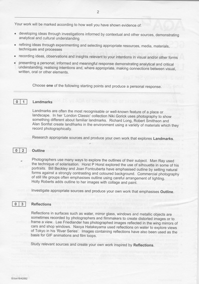
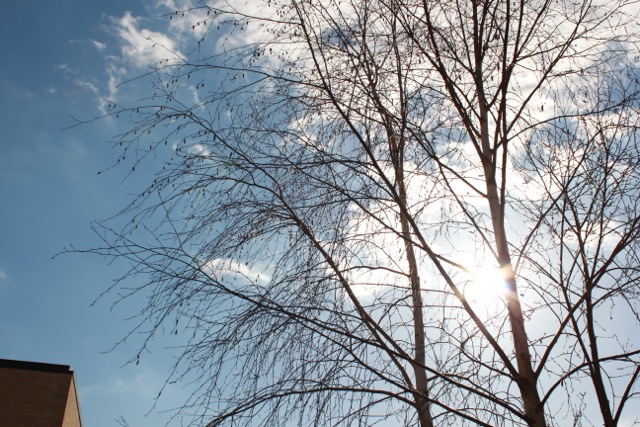
Outline
Photographers use many ways to explore the outlines of their subject. Man Ray used the technique of solarisation. Horst P Horst explored the use of silhouette in some of his portraits. Bill Beckley and Joan Fontcuberta have emphasised outline by setting natural forms against a strongly contrasting and coloured background. Commercial photography of still life groups often emphasises outline using careful arrangement of lighting. Holly Roberts adds outline to her images with collage and paint.
I chose outline because I thought it would be something really fun and interesting to do because I have never done it before and I can experiment many different things with outline.
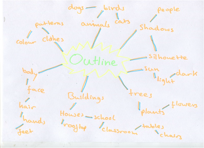
This is a mind map of my first ideas and thoughts for what I will be doing for Outline. Some ideas are basic because I haven't researched anything to do with Outline but I think I will be using some of these ideas for my project.
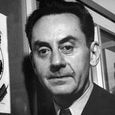
Artist Research: Horst P Horst
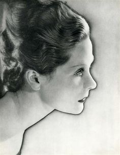
Horst P Horst was a German- American fashion photographer. Most of his images are black and white, Horst would put his models under spotlights against plain backgrounds with careful precision. The compositions of clothing, lighting, furniture create atmospheric silhouettes.
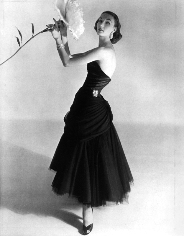
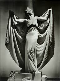
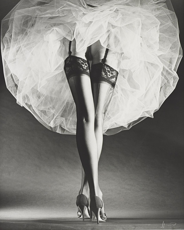
I really like these images because the composition works really well and the dresses has lots of different patterns on. The patterns on clothing emphasise the outlines and make them stand out. I could use his idea of silhouette in my photography to make the outlines look more bold. I also like the back and white effect because it makes the images look old fashioned and makes the outlines on the images look more visible. I like the choice of clothes and dresses in his photography because they have interesting lines and shapes on them.

|
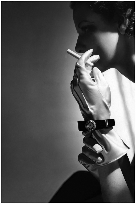
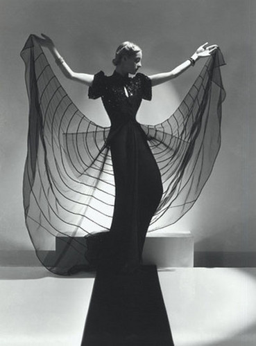
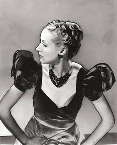
This is my favourite image by Horst P Horst, I like this image because the dress has a interesting pattern on it where the model is holding. The pattern almost looks like a spiderweb making the outline stand out more. The composition is well because the model is standing right in the middle and a spotlight is on her, this makes he the main subject of the image. I also like the way her arms are stretched out while her head is turned to the side because this outlines the shape of her body. The black and white also works really well because it emphasises the contrast of the black dress and the white background. I will be using contrast in my images to make the outlines more visible.
|
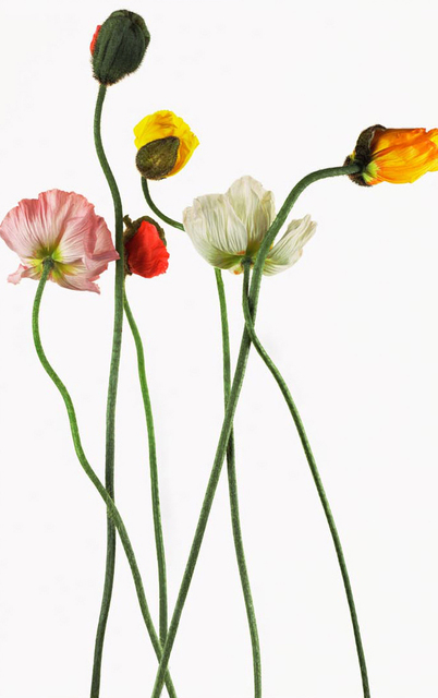
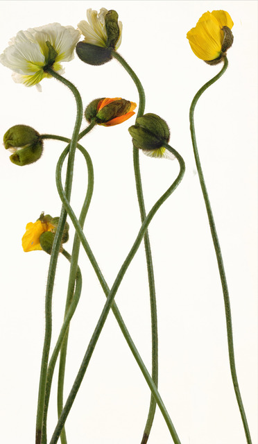
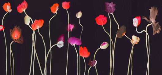
Research: Bill Beckley
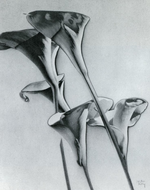
Bill Beckley is a narrative conceptual artist, images that tell a story. Bill uses colourful flowers and nature to show outline. I like his images because the outline and focus on the flower is strong, the different colours make the image stand out.
Research: Man Ray
|
Man Ray was a abstract painter and photographer. His work included painting, sculpture, film, prints and poetry. His work styles were influenced by Cubism, Futurism, Dada and Surrealism. He is most remembered for his photographs for the inter-war years, in particular the camera-less pictures he called 'Rayograph'.
|
Solarisation (the Sabattier effect)
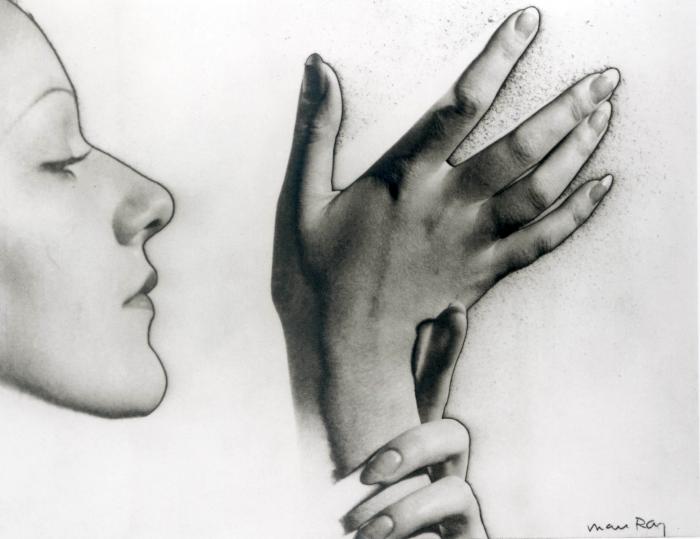
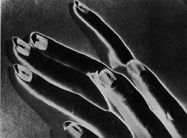
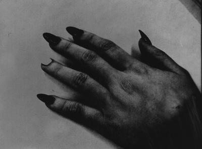
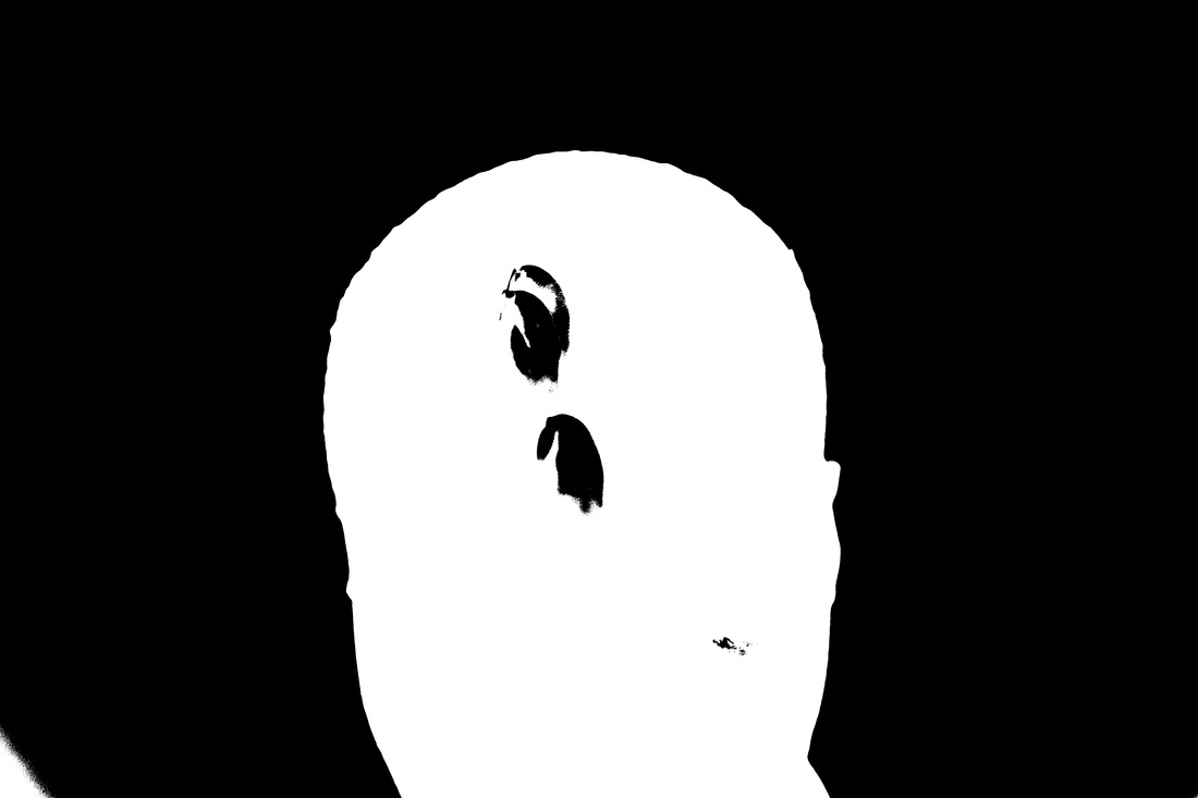
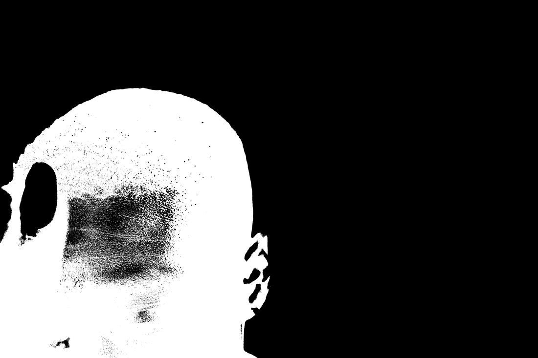
Solarisation is a image recorded on a negative print where the dark and light areas are reversed in tone. Dark areas appear light and light areas appear dark. Man ray discovered solarisation by accident when he was making a photogram. He experimented this effect on images on woman's faces and body, I think he did this because a human body has loads of defined outlines such as face, hair, hands. I am looking forward to experiment solarisation with my own set of images. Here are some solarised images that Man Ray made:

|
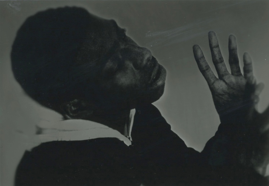
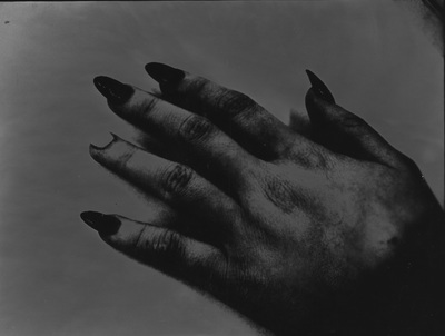
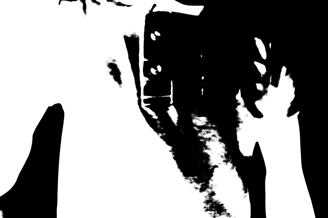
This is my favourite image by Man Ray because the solarisation effect is very bold and clear in this image. I like the dark background in contrast with the white highlight around his fingers.
I think Man Ray experimented many times to get this result because solarisation takes a lot of trial and error to get a perfect image. I will be trying to achieve this result in my solarisation images. |
Original Images
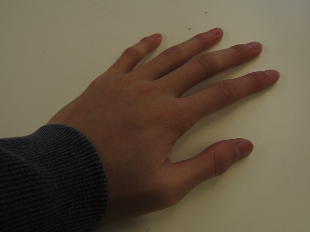
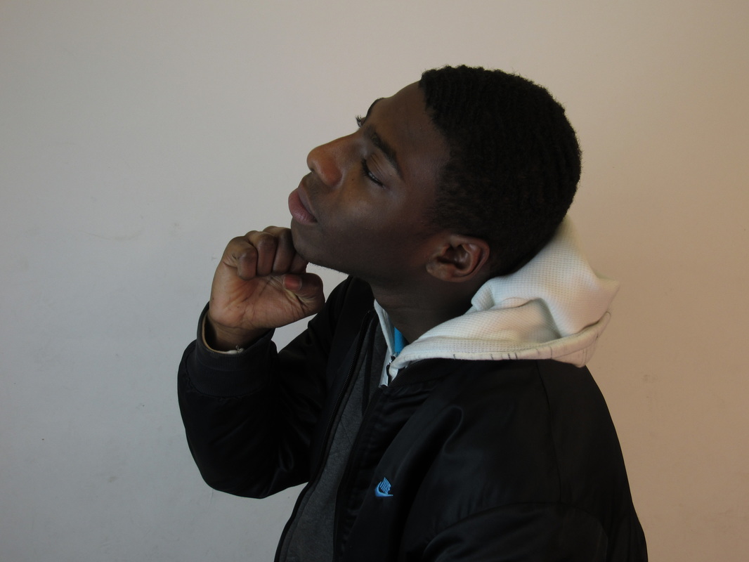
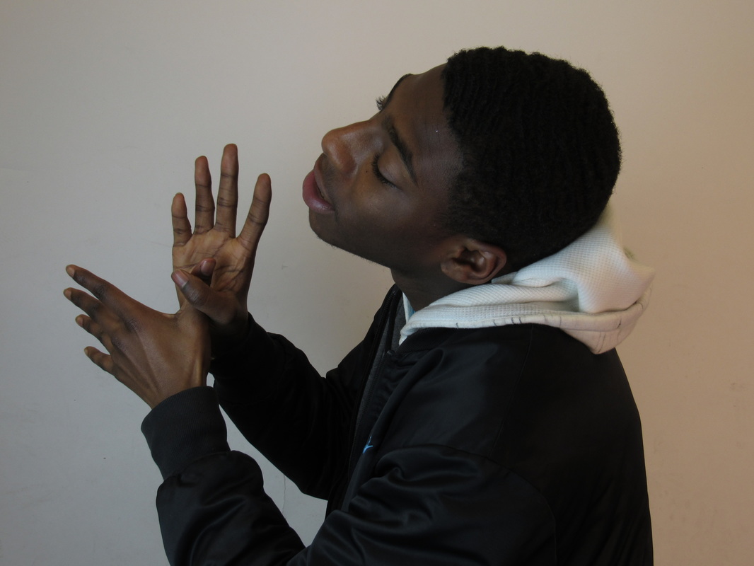
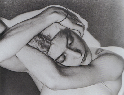
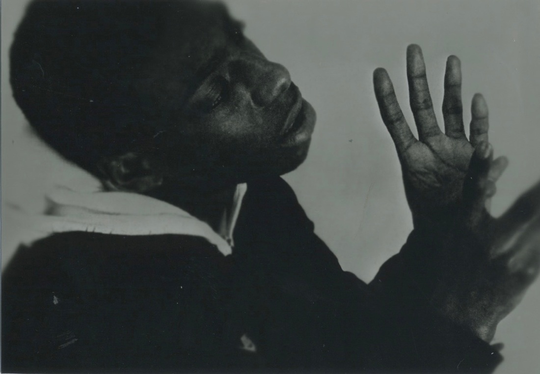
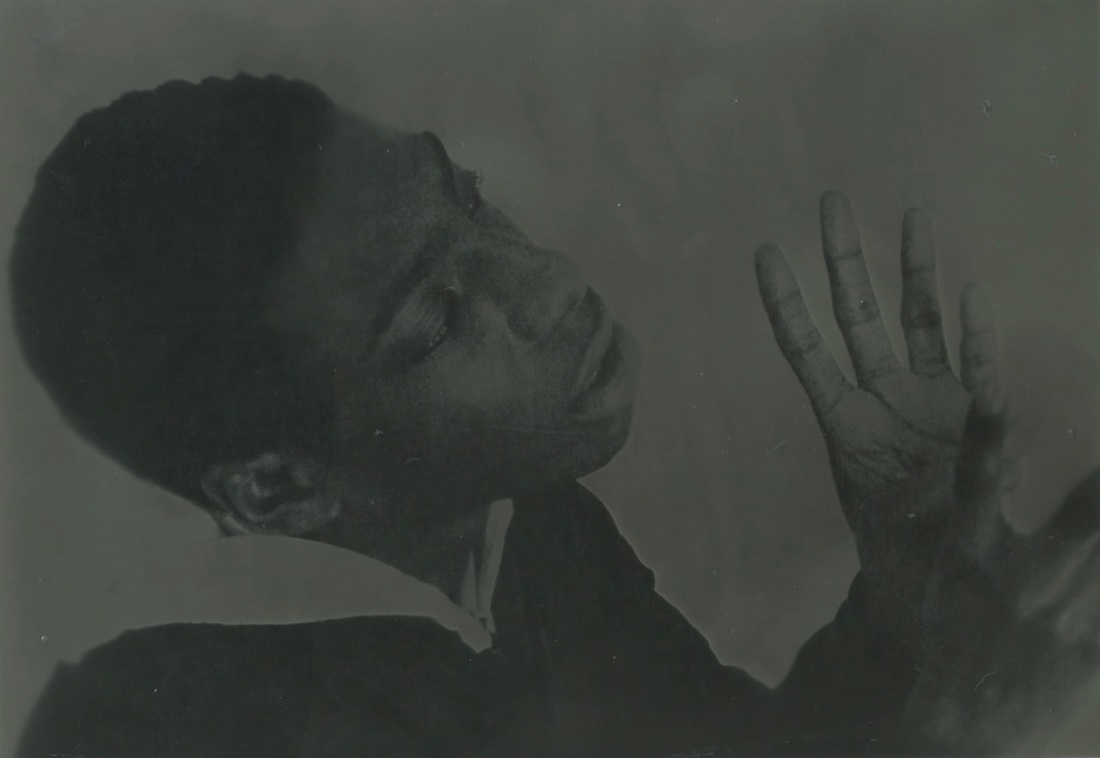
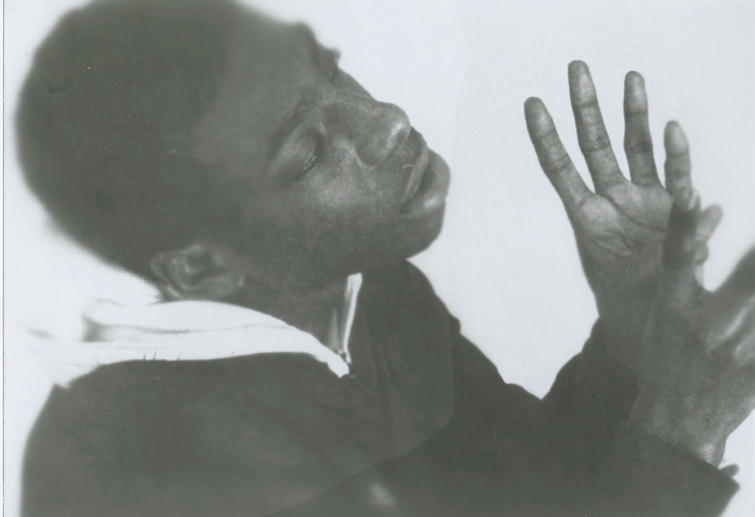
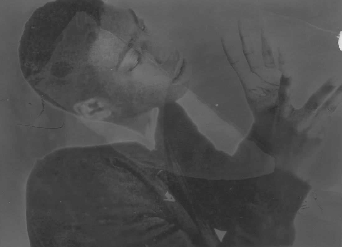
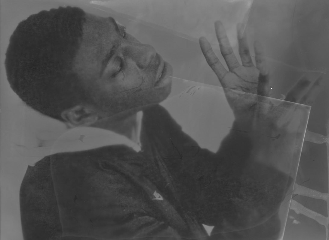
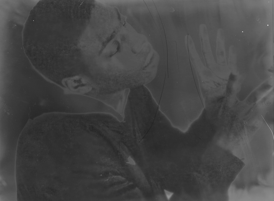
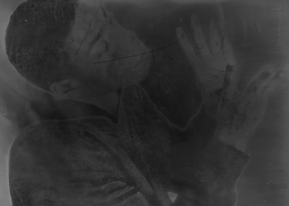
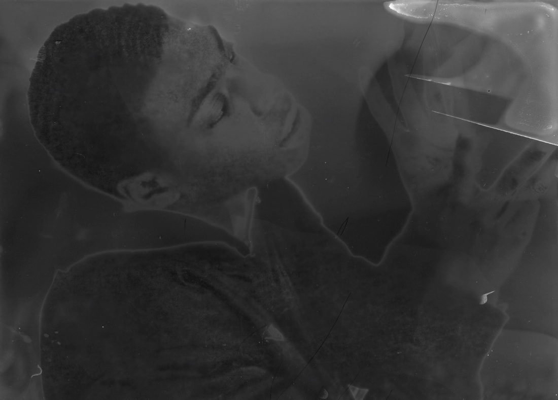
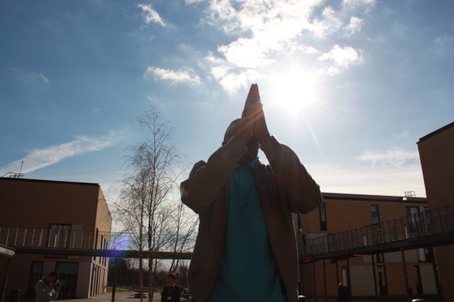
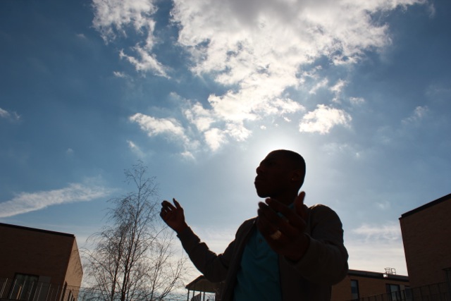
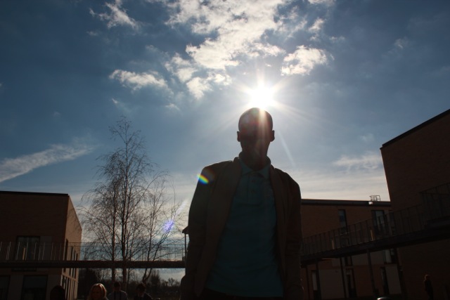
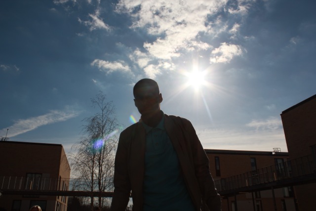
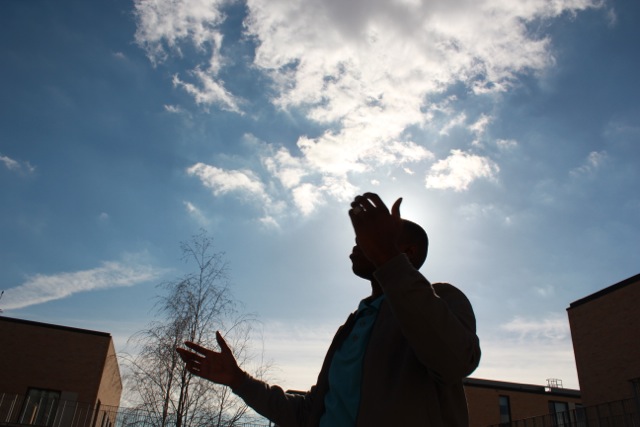
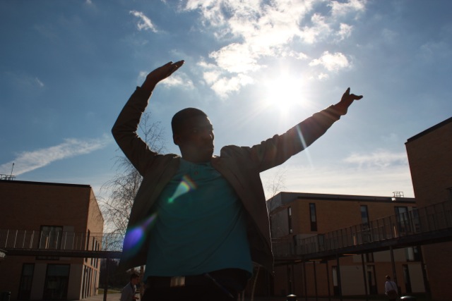
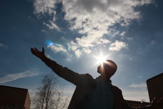
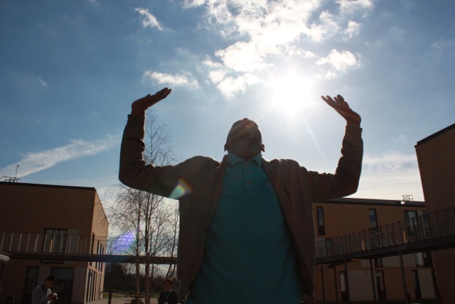
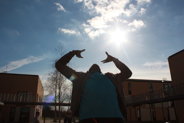
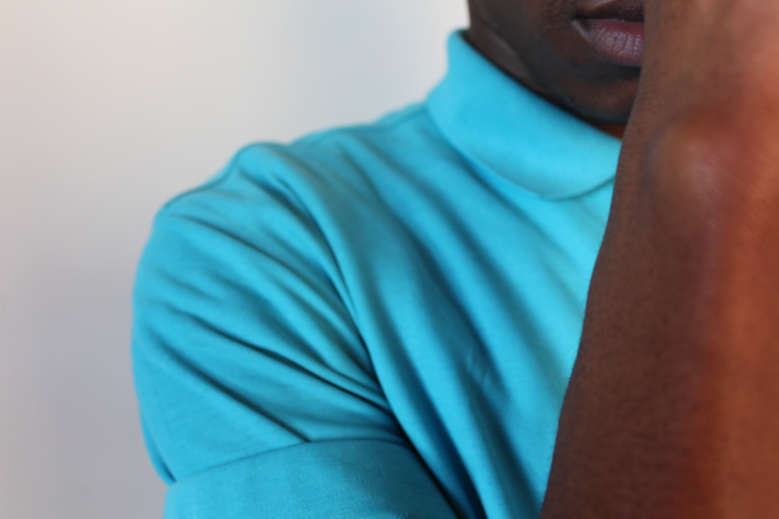
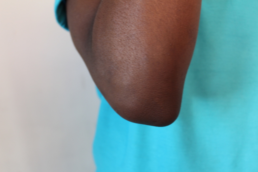
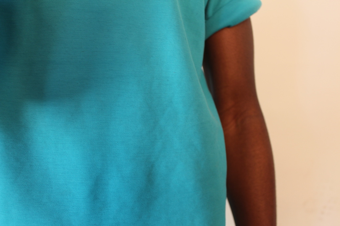
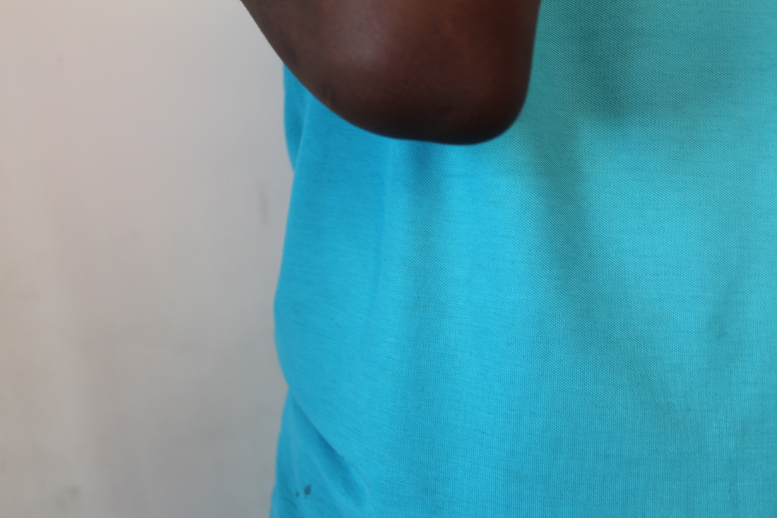
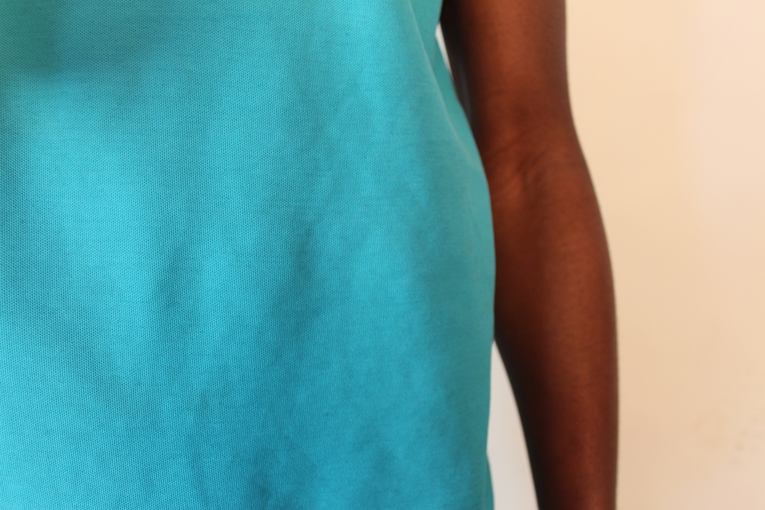
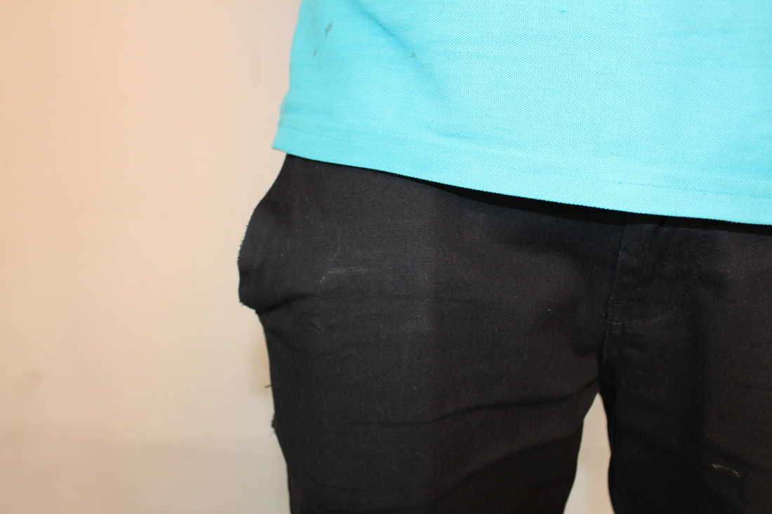
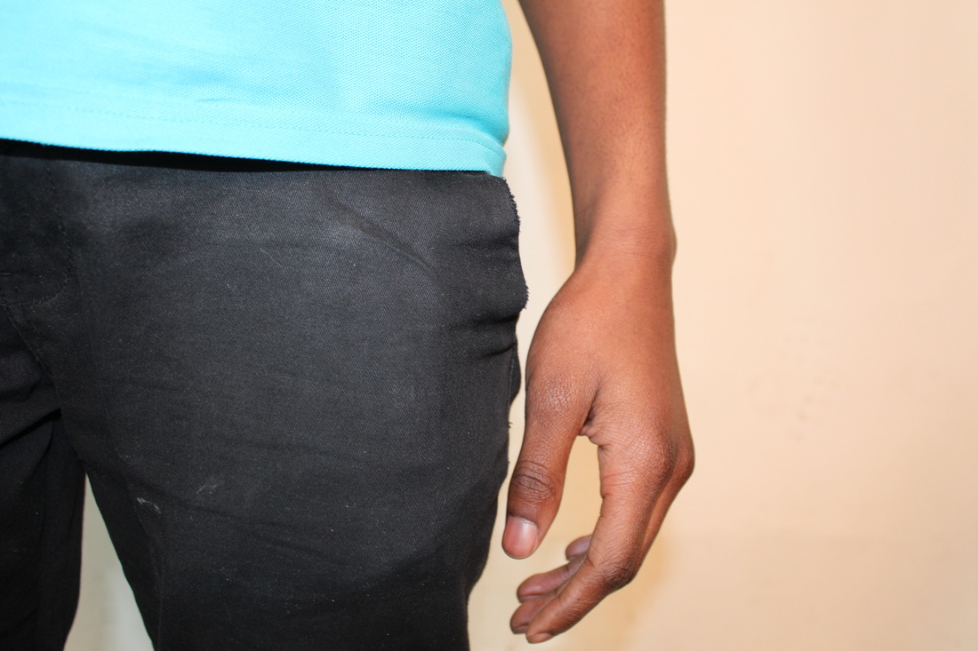
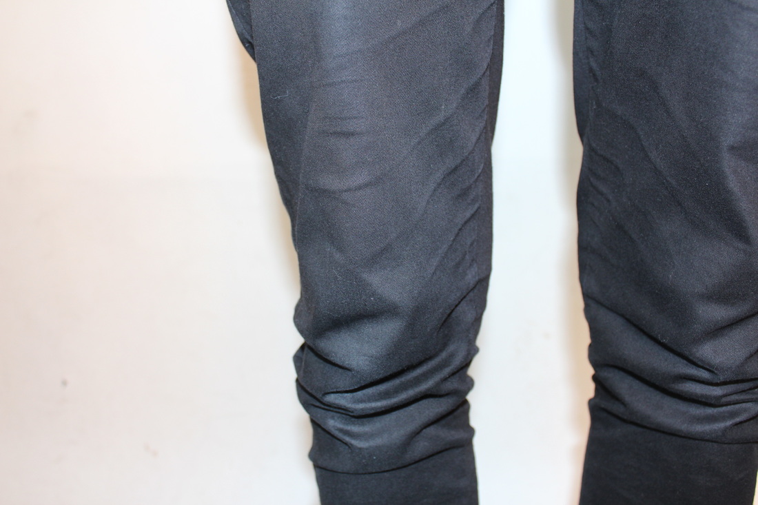
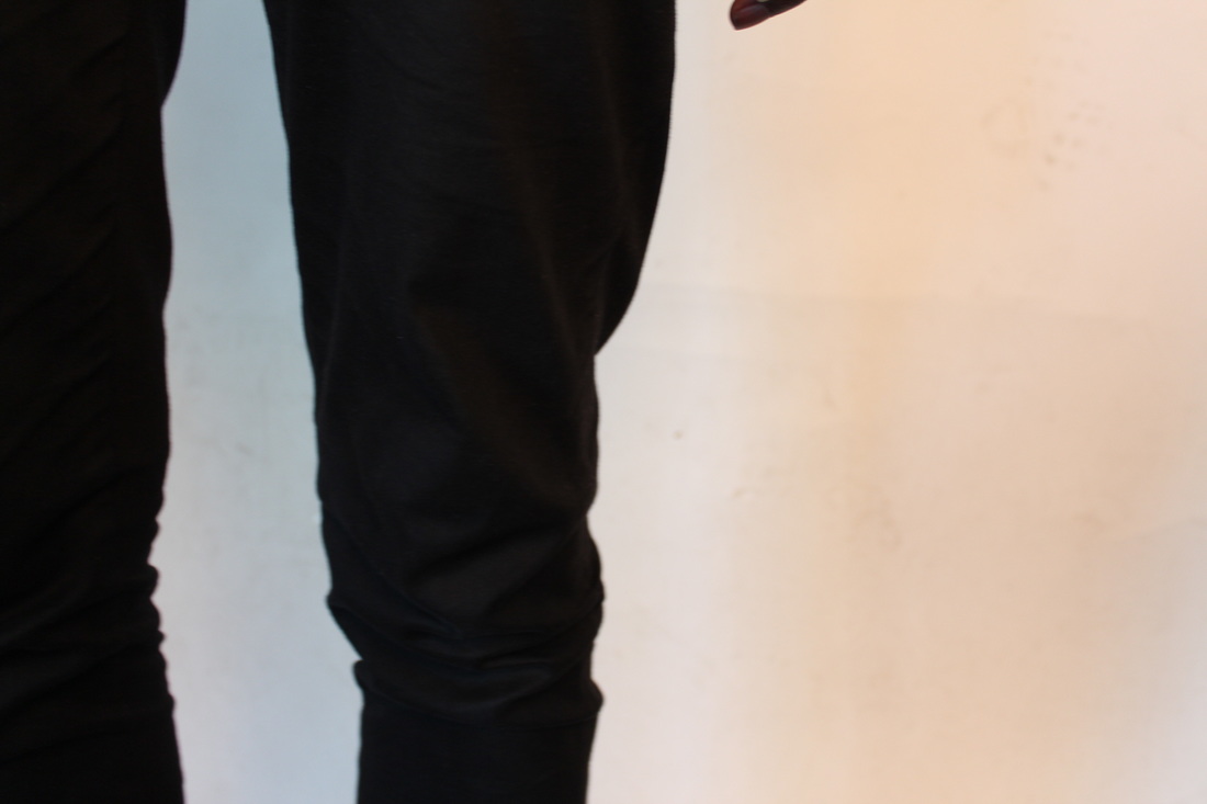
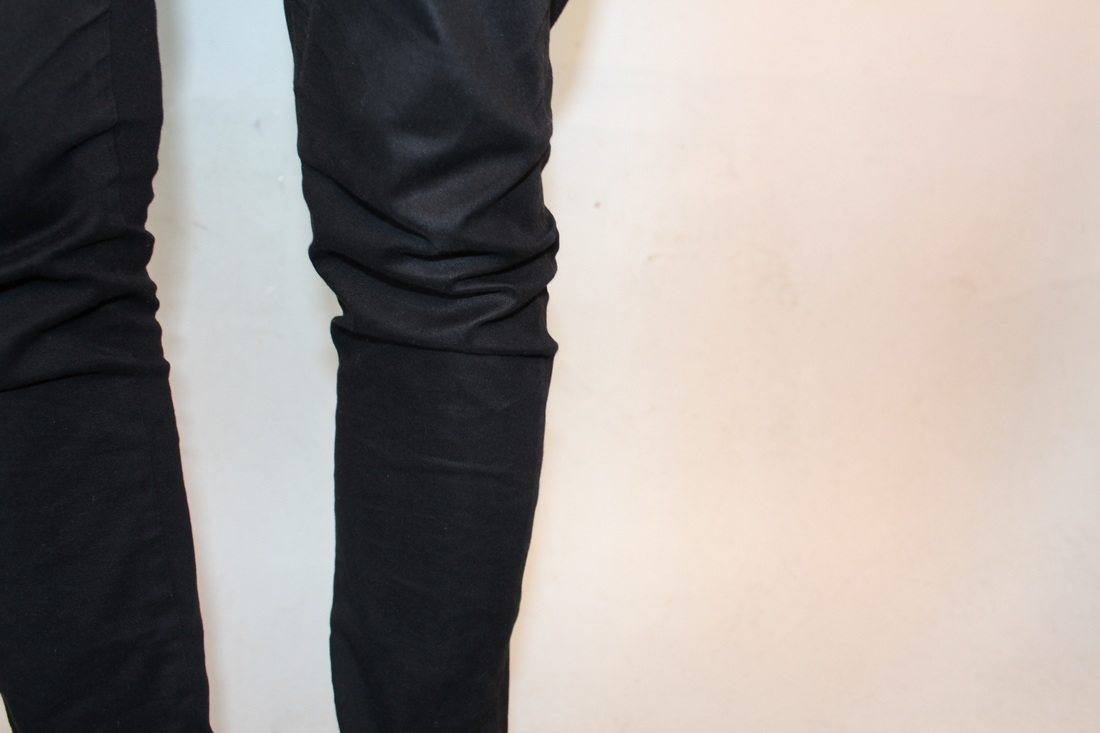
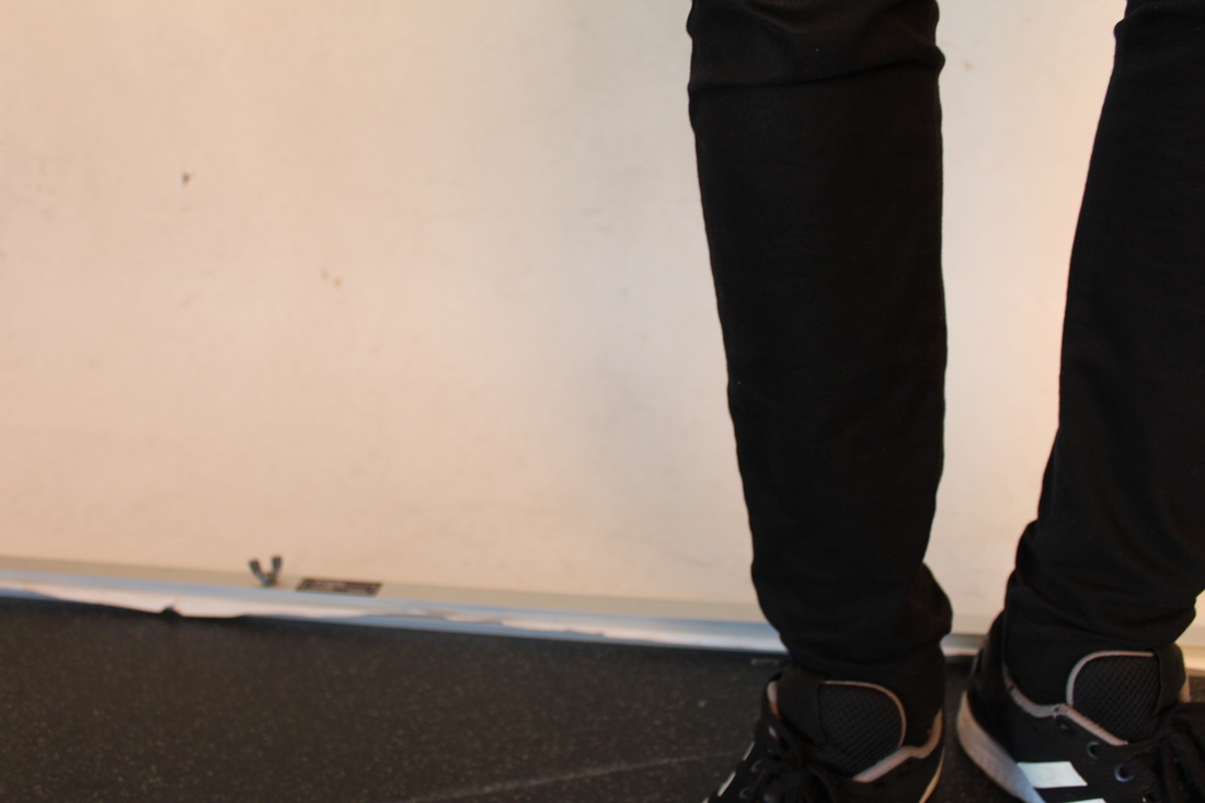
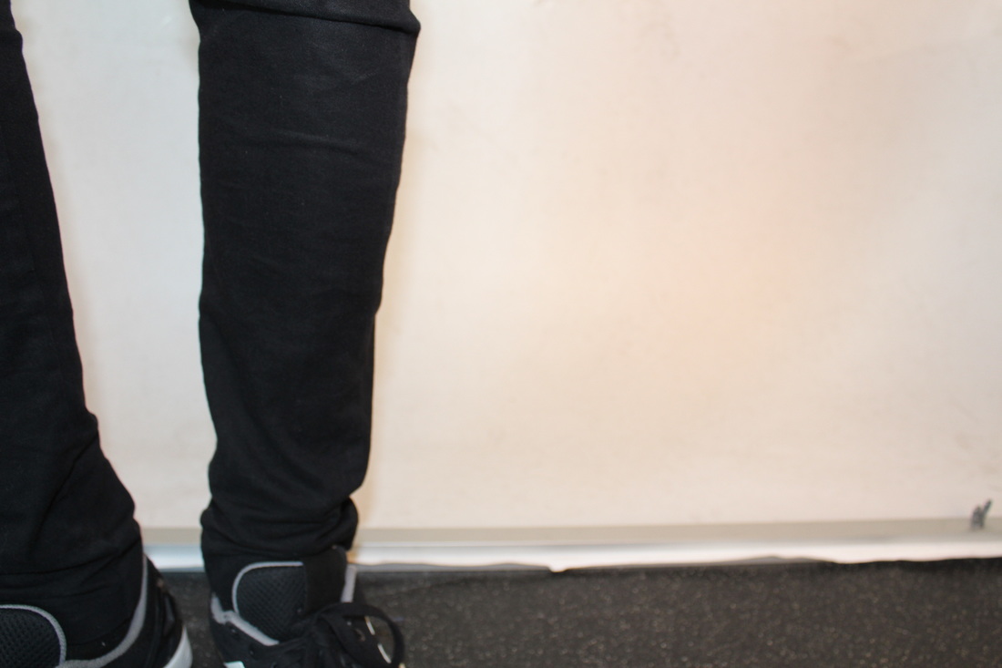
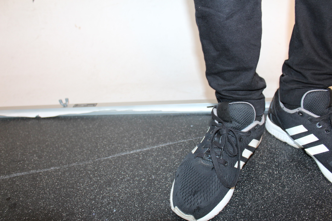
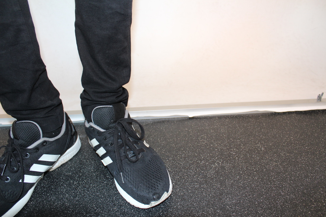
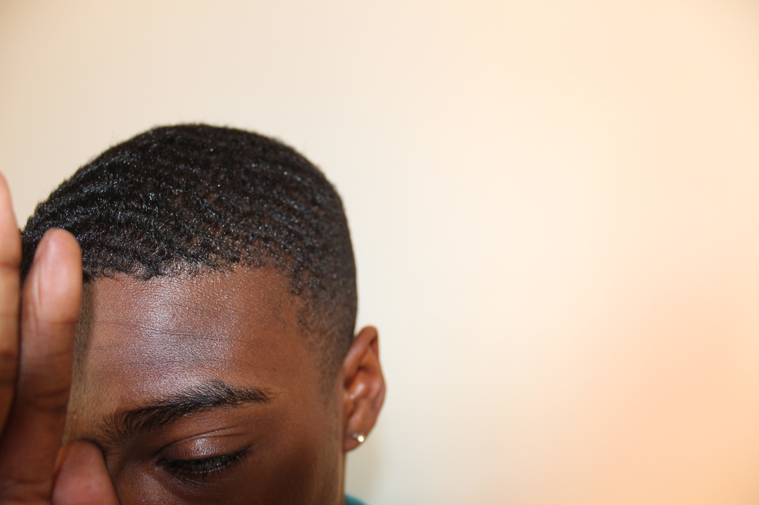
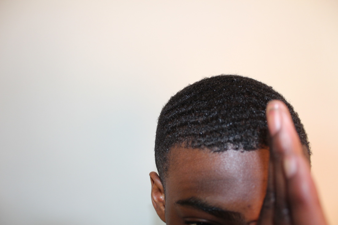
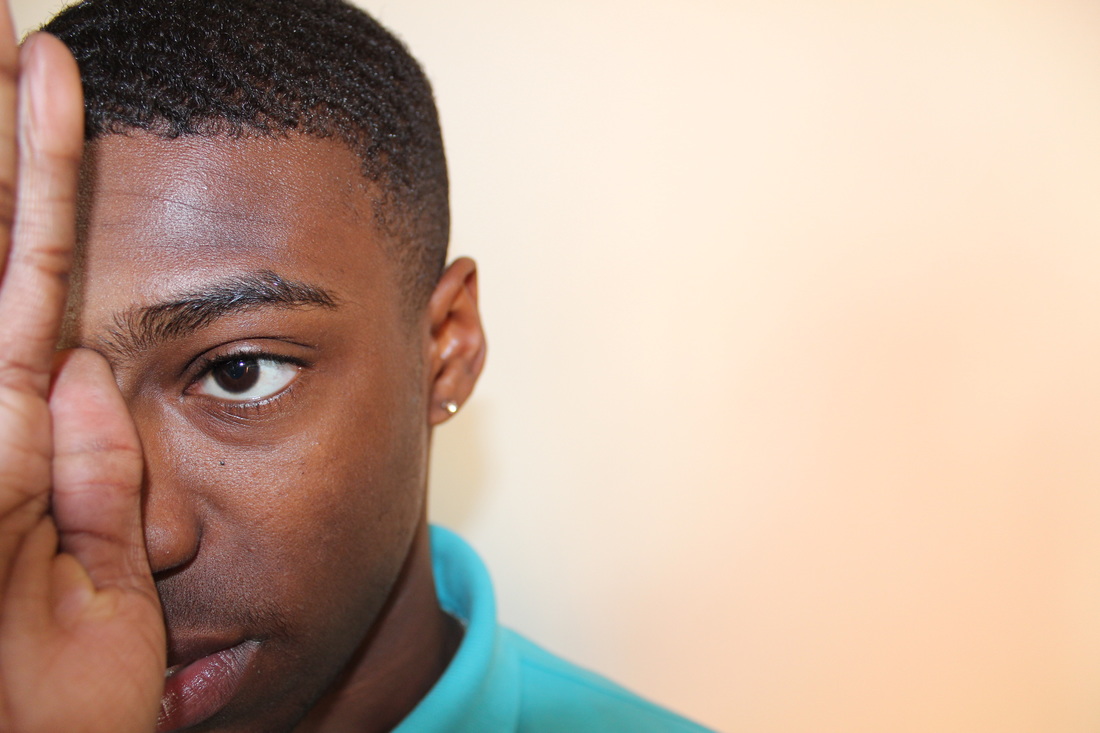
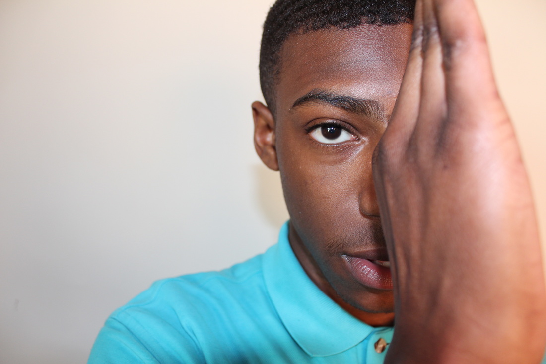
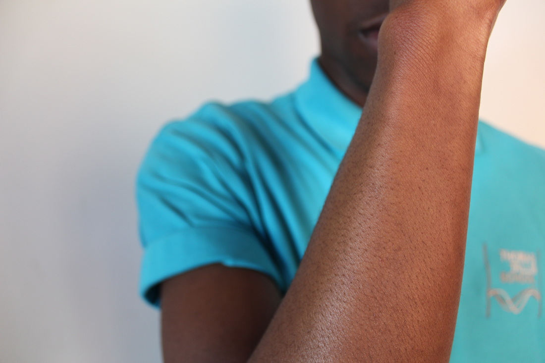
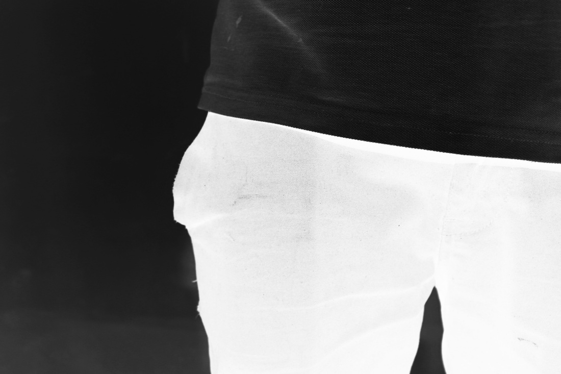
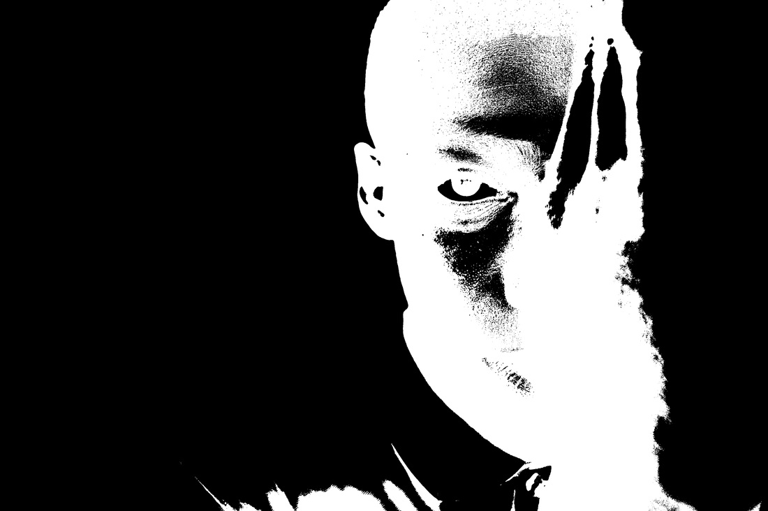
I responded to Man Ray's work by taking images of Peter's body and face for my solarisation images. These are the original images I look using the camera. The images of the hands will work really well with the solarisation effect because the shape of the hand will be bold and the contrast against the white table will stand out. I like the images of Peter because his head is turned to the side and his hands are making a interesting pattern, the outlines will work well with his figure shape.
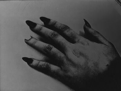
Image set: 1
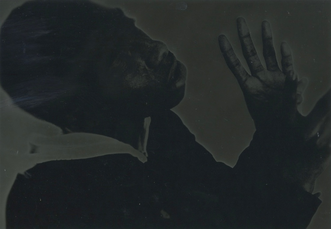
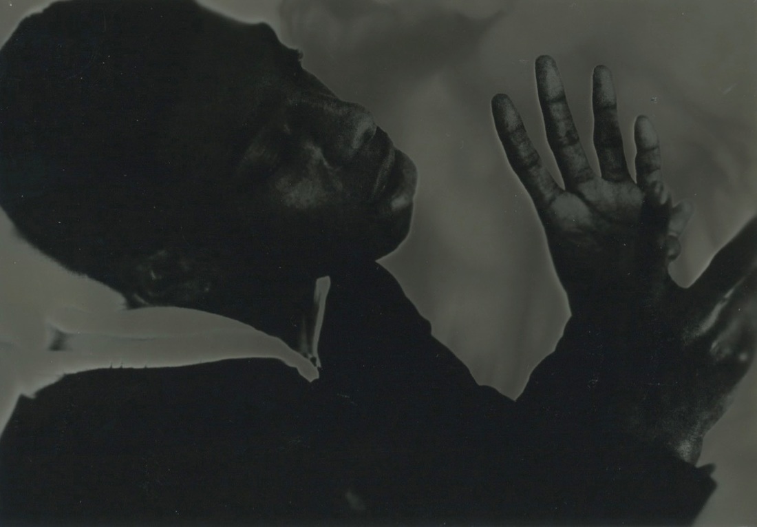
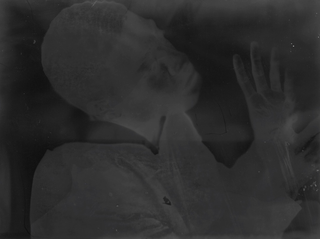
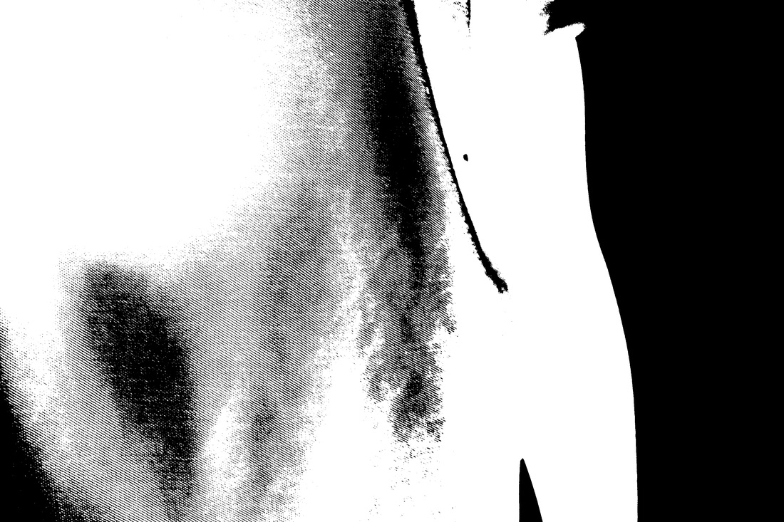
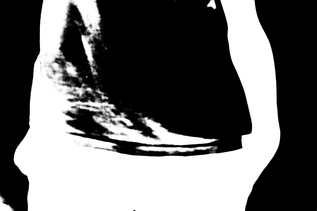
This is my first attempt of trying to create a perfect solarised photogram in response to Man Rays work. Firstly I have taken the original image and put it in photoshop, changed them into black and white then inverted it so it became negative and printed it. I have also adjusted the contrast so the dark areas appear darker and light areas appear lighter. I then printed it out and went into the darkroom. I have used a machine called the enlarger to print the image onto the paper, I experimented the amount of time I exposed the paper under the enlarger to get the perfect result. I chose to expose the paper for 10 seconds and this is the time I used for every image. I used an aperture of f.8. Next I put the paper in the developer, I waited for about 50 seconds then turned the light one for 1 second. This is what causes the solarisation effect where the dark areas become light and light areas become dark, I have also noticed that a white line appears around the outlines, this is what makes the solarisation image successful. I think that some of these images were not successful because I left them I the developer for too long and the image became too dark. Another reason the image did not work was because I left the light on for too long or too short. This over exposed the image so the effect didn't work. Next I will create a final solarisation image that will be large displayed for my final image.
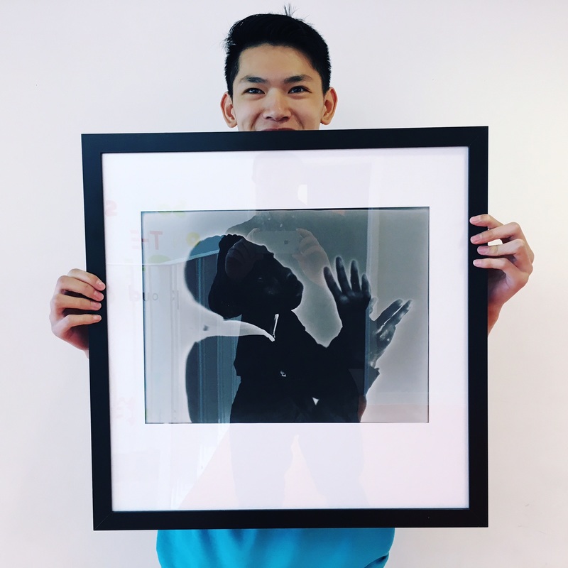
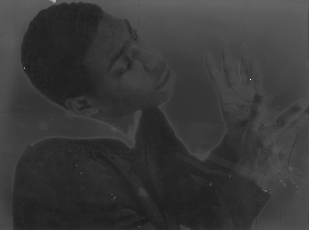
First Final Image
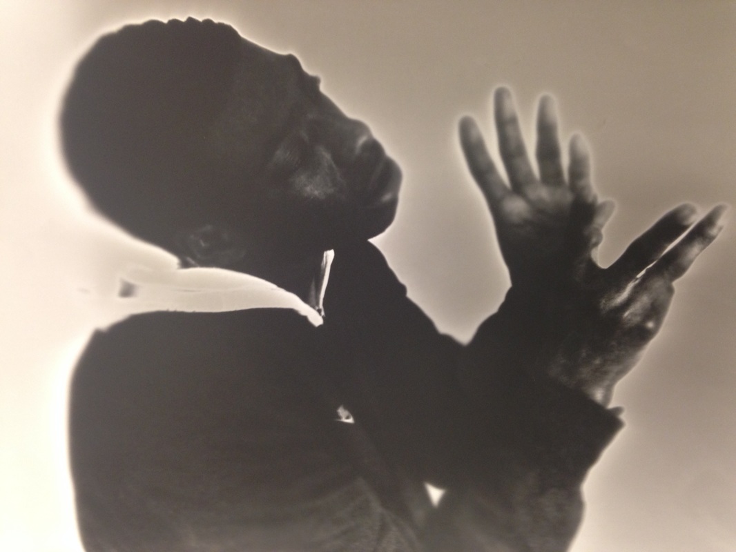
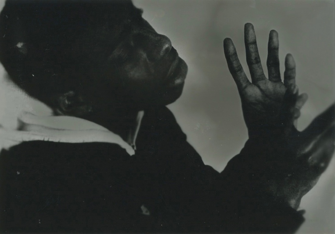
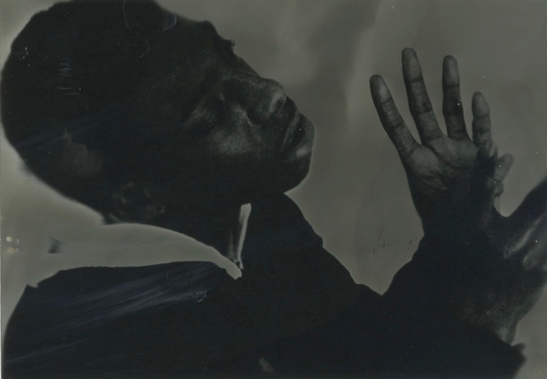
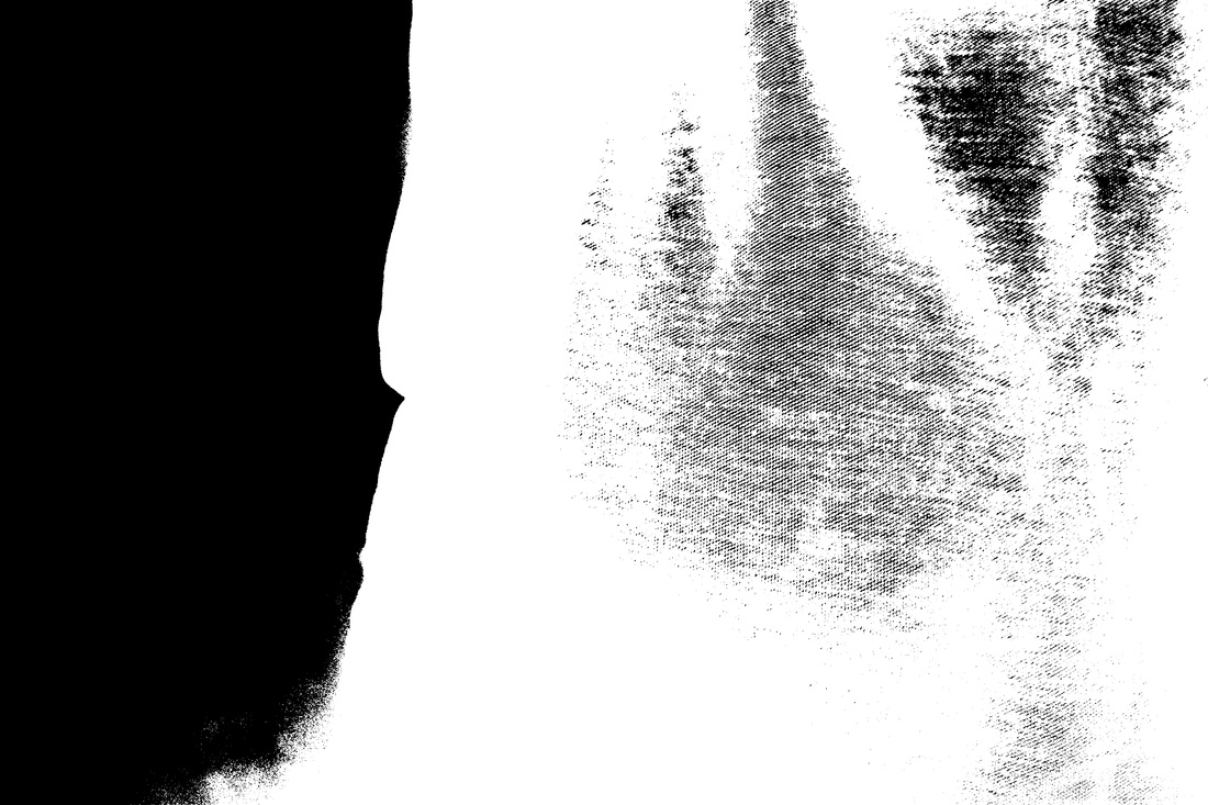
This is my first final image that will be displayed, This is a larger printed image, to create this image I first used photoshop to turn it black and white and inverted it, I used the same techniques and processes from my first set of images. I tried to make this piece as perfect as possible because I only had one chance to make a large photogram. I chose to expose the image under the enlarger for 10 seconds because I figured it was the best time to expose for. I then developed the image in the developer and turned on the light for 1 second, as it developed, I could see the white outline forming so I knew the effect worked. After I processed the image and scanned it using the scanner. I thought this image was successful because I can clearly see the solarisation effect worked well and the contrast is strong.
Presenting and Dislaying
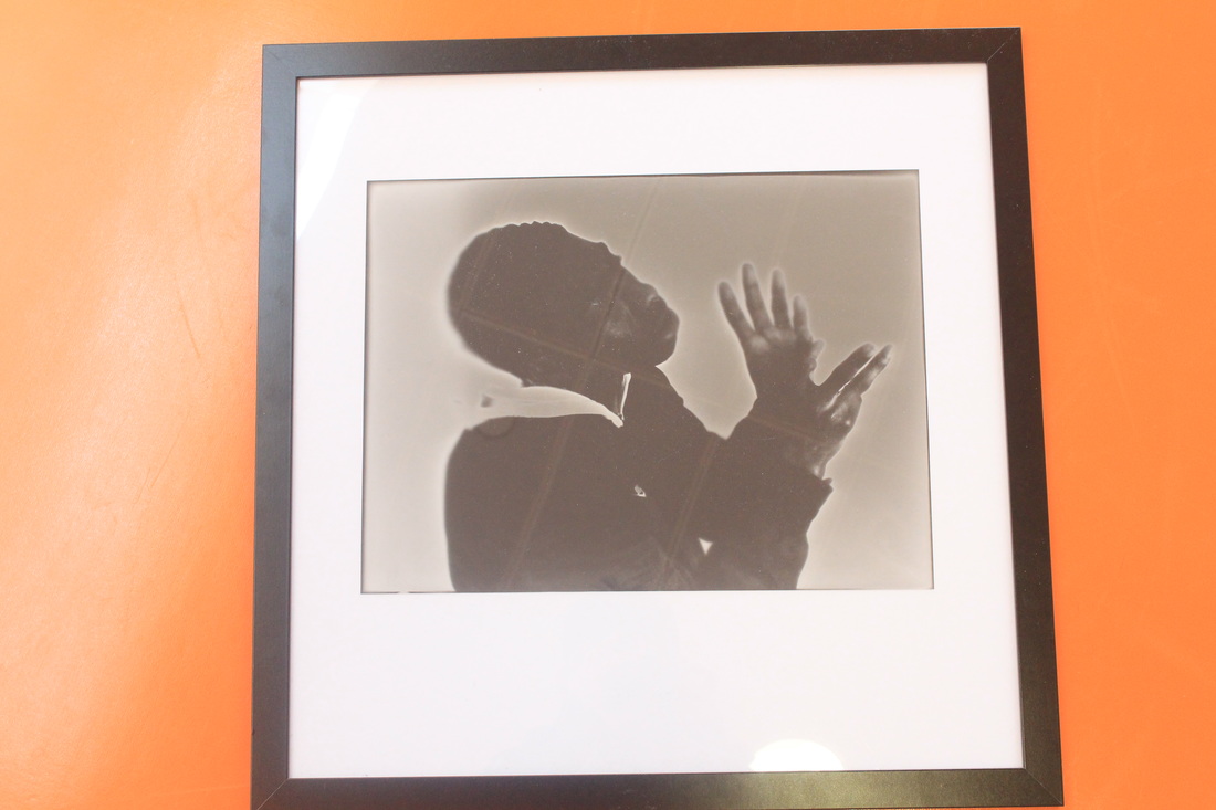
To display this image, I first mounted it on card and then framed it, I decided to put it in a frame because I thought it would look good as it is just the right size. I am satisfied with the result of this piece because the outcome was what I wanted. I tried to achieve a solarisation image where there is a bold contrast between dark and light areas. The solarisation effect work well in this image because the outlines are really clear with the white highlight. If I had more time I would create more of these large photograms that display the theme of outline and solarisation. I hope that viewers would look at this piece and know straight away what effect I used.
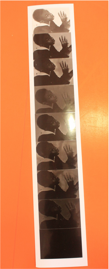
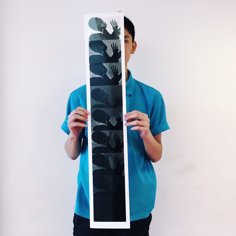
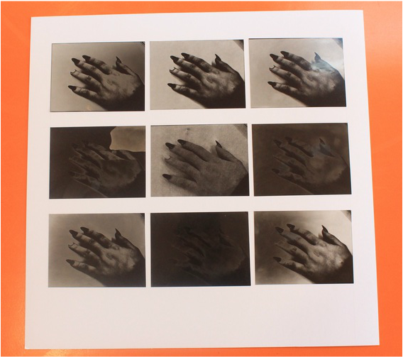
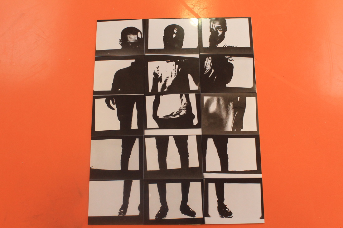
This is how I chose to display my first set of images. These images are really small so I thought they would look better as a group rather than separate, I decided to put the images in order from light to dark so it would look more interesting rather than random placement.
I think this final piece is successful because it shows the effect of solarisation in multiple images and the outlines are clear. I hope that viewers would look at my work and question how I made this and want to know more about it, the composition also makes this piece work well because they can see clearly what the order is.
I think this final piece is successful because it shows the effect of solarisation in multiple images and the outlines are clear. I hope that viewers would look at my work and question how I made this and want to know more about it, the composition also makes this piece work well because they can see clearly what the order is.
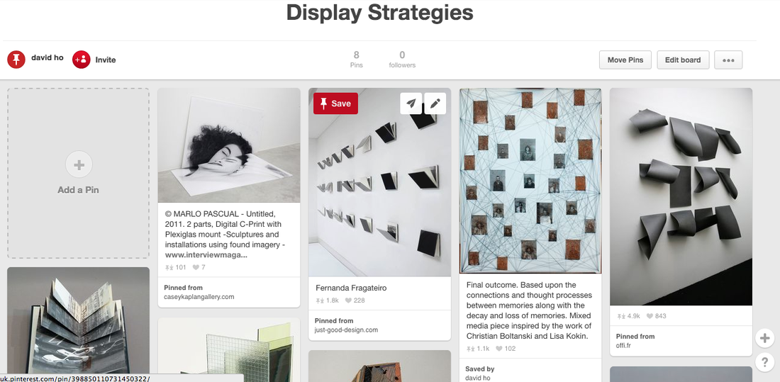
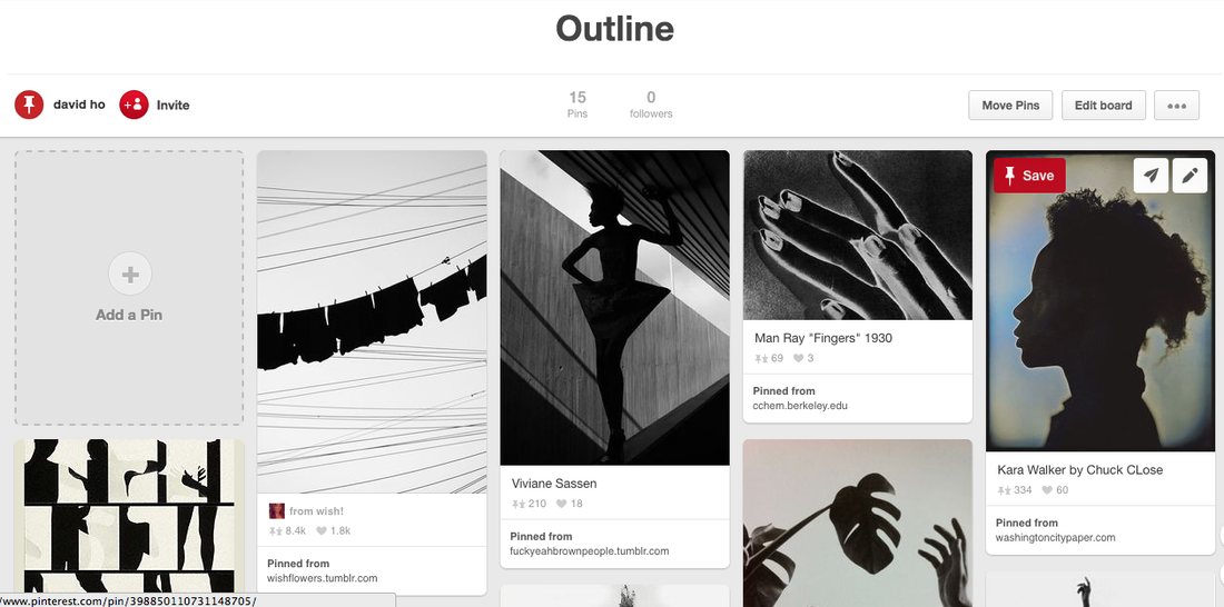
I have researched on Pinterest of different display strategies that I could use, I found some abstract and interesting ones that present the work in a intriguing way. For example the books on that wall looks fascinating because we can't see whats inside it so we would approach and open them.
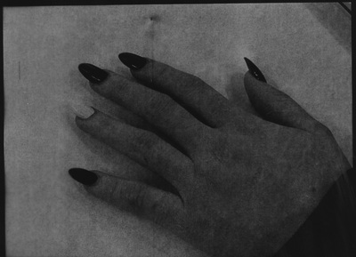
Image set: 2
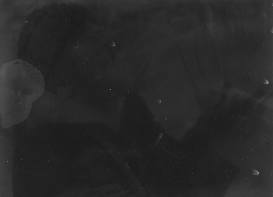
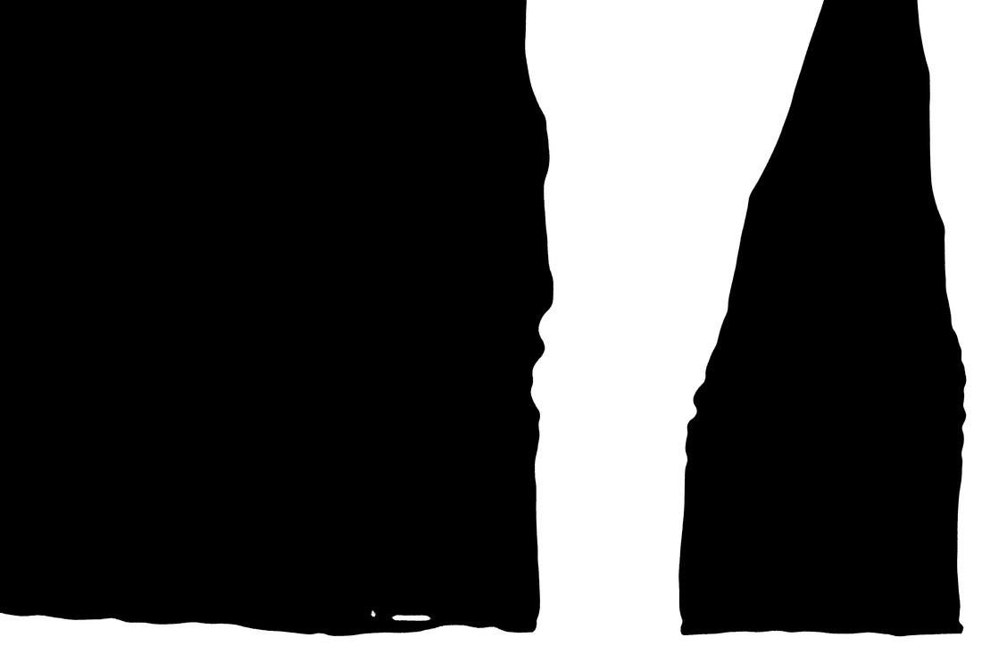
This is my second attempt to create a solarised image. I tried refine and develop the images I made the first time but it was not very successful. It was hard trying to get the same effect due to various reasons. The amount of time the paper was developing might of been too long or too short, or the amount of light exposed to the paper could be too much or too little, which made it difficult to try get exactly the right effect. I experimented many times; some images worked well because you can see the white highlight around the outline and that is what I tried to get. These images came out in a bad quality compared to the first time which may have been because I used different paper or enlarger. I think these images look stained and scratched because I hung them too close together while they were still wet so they stuck to each other, I will make sure this doesn't happen in my next set of images. However, although the quality is not as good as the first set of images, the solarisation effect worked better because more images has the white outline around it. Next I will experiment with a different image.
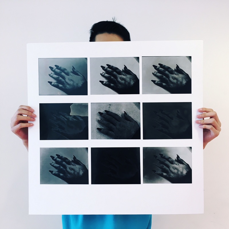
Image set: 3
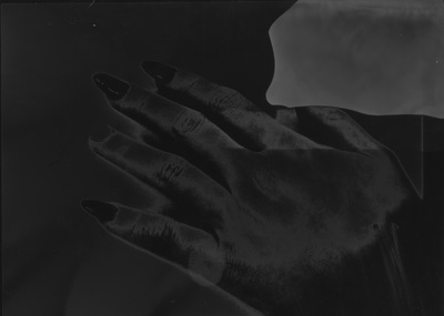

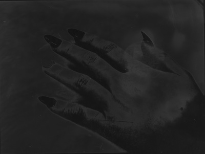
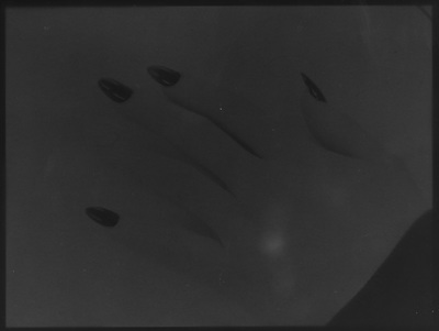
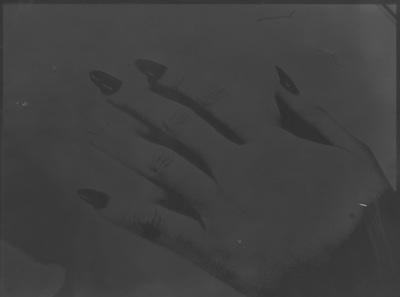
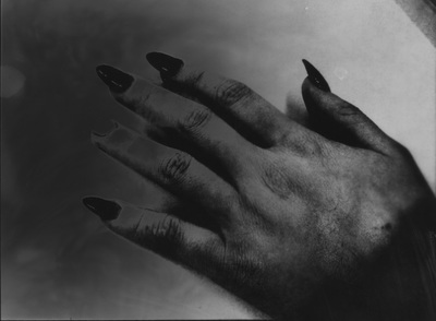
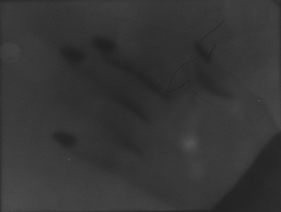
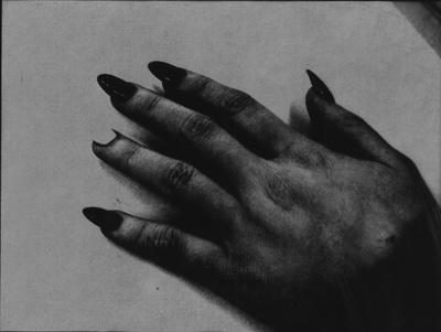
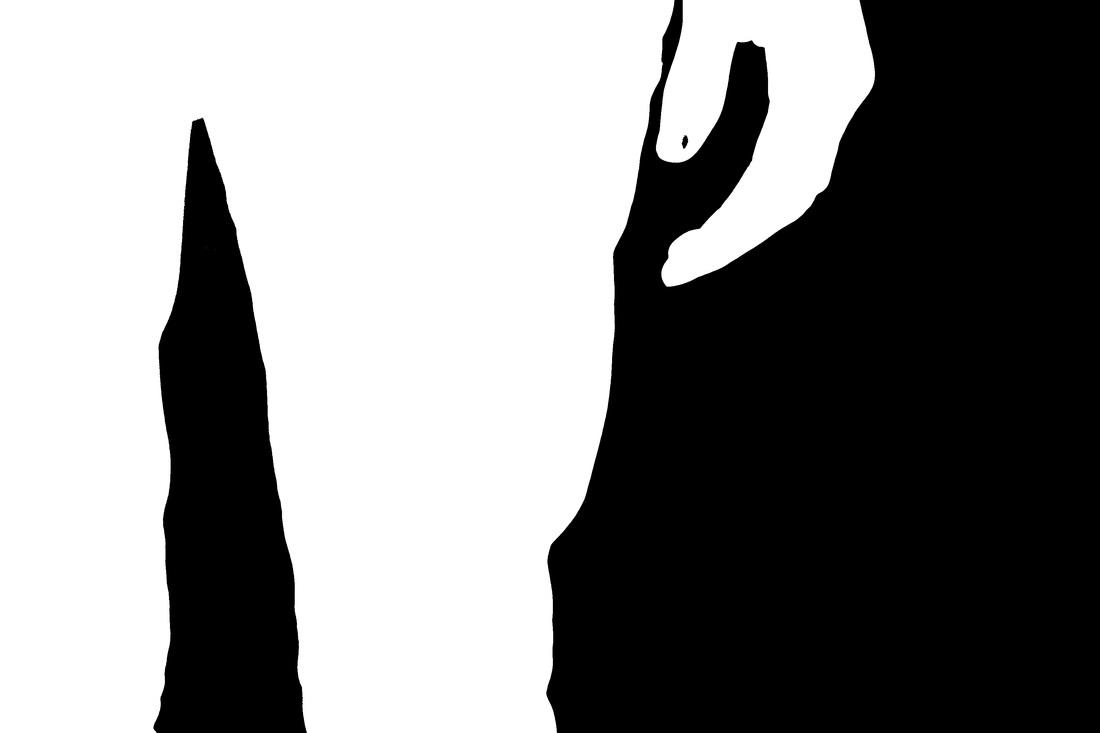
I chose to use a image of a hand in this set of images because I was inspired by Man Rays hand solarisation that was very successful. I used the same technique and processes to create these images in the dark room. I think some of these images didn't work because the paper was upside now when I used the enlarger. Once i noticed this mistake I made sure the paper was the right way for the next images
Image Set: 4
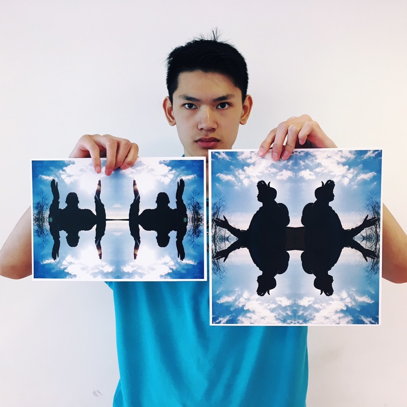
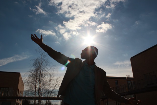
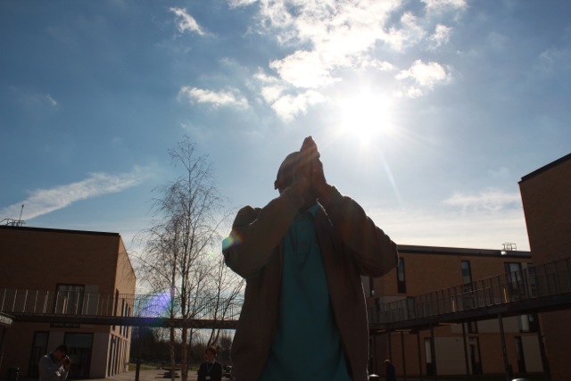
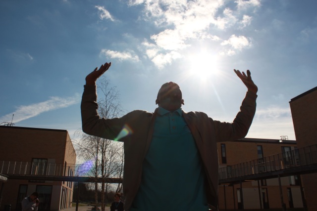
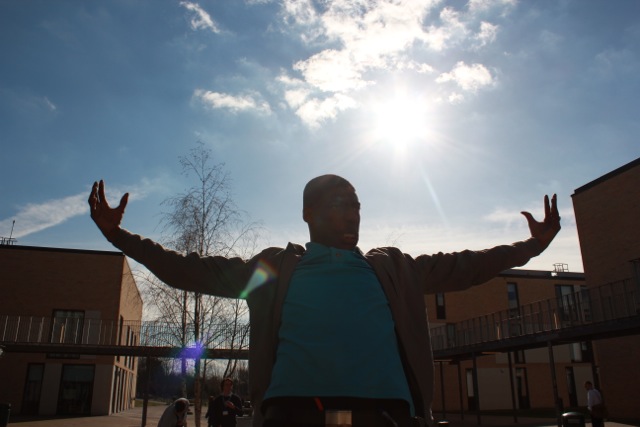
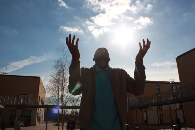
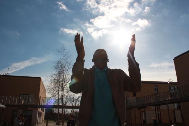
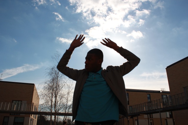
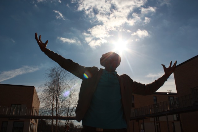
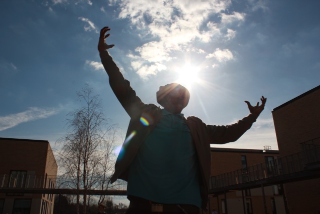
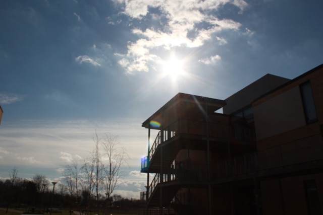
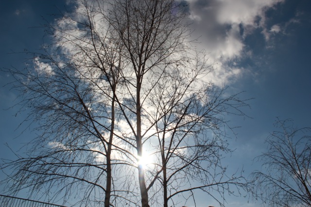
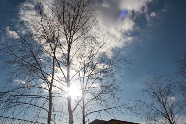
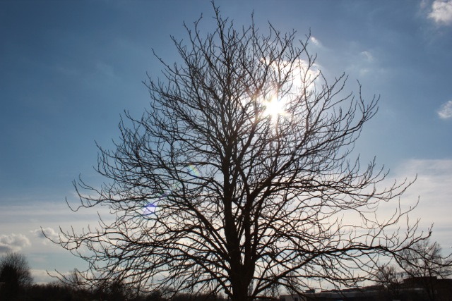
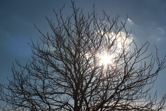
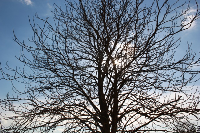
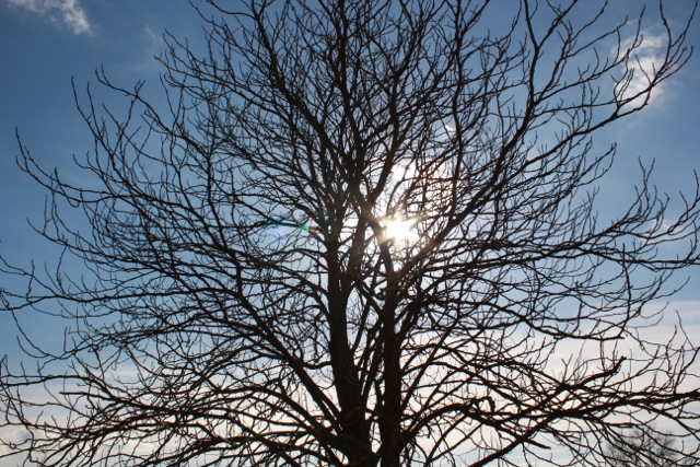
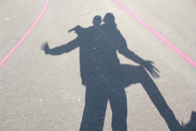
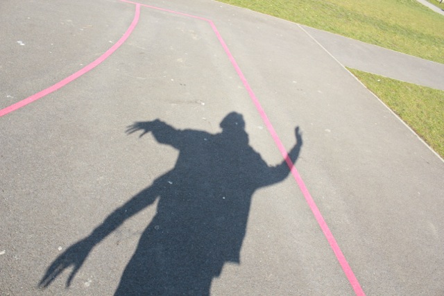
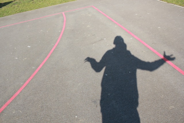
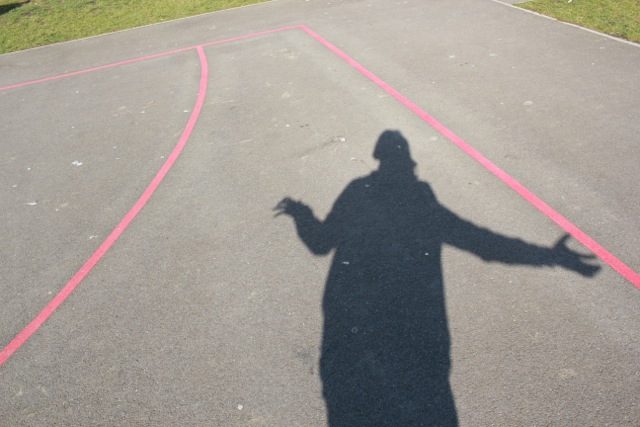
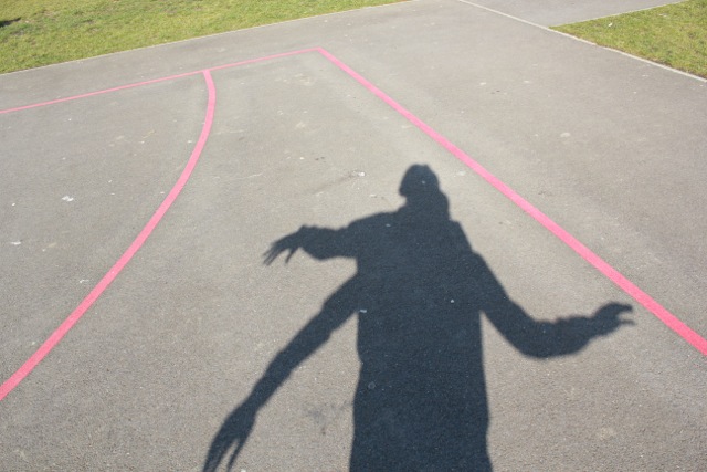
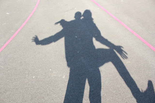
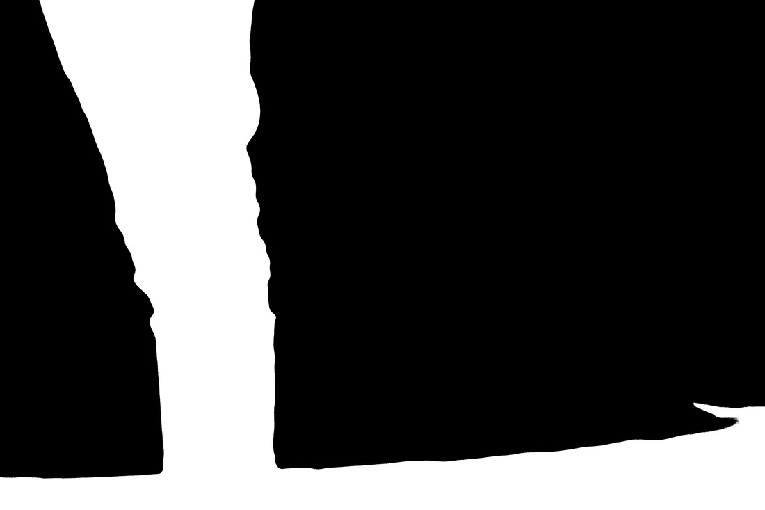
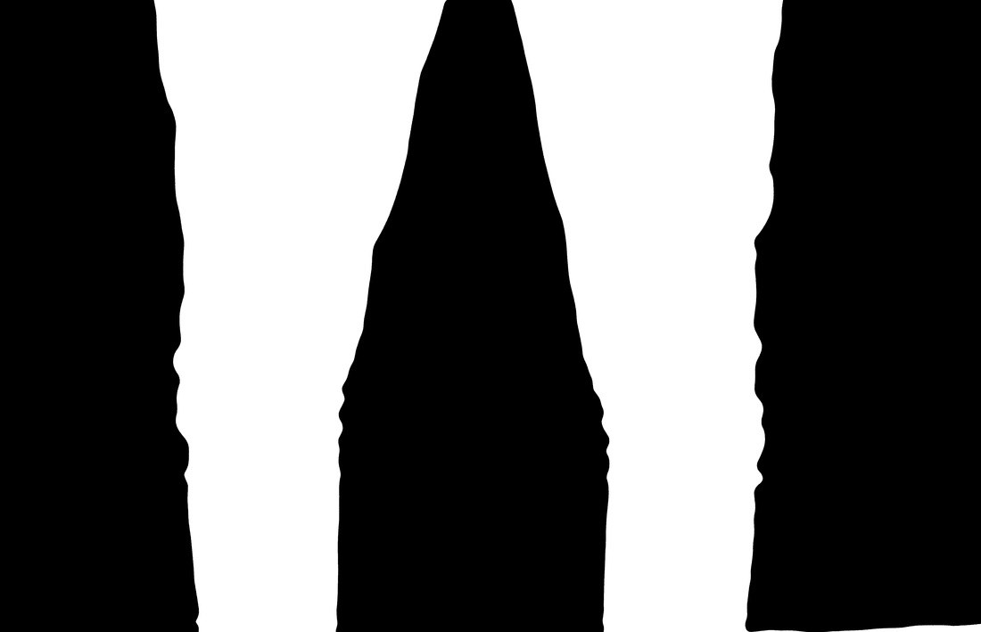
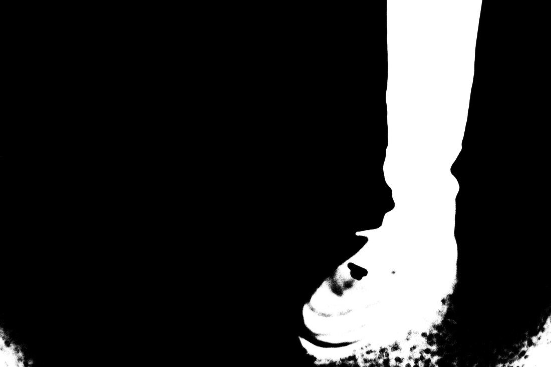
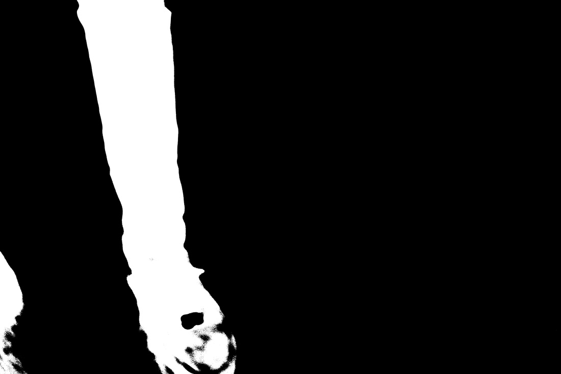
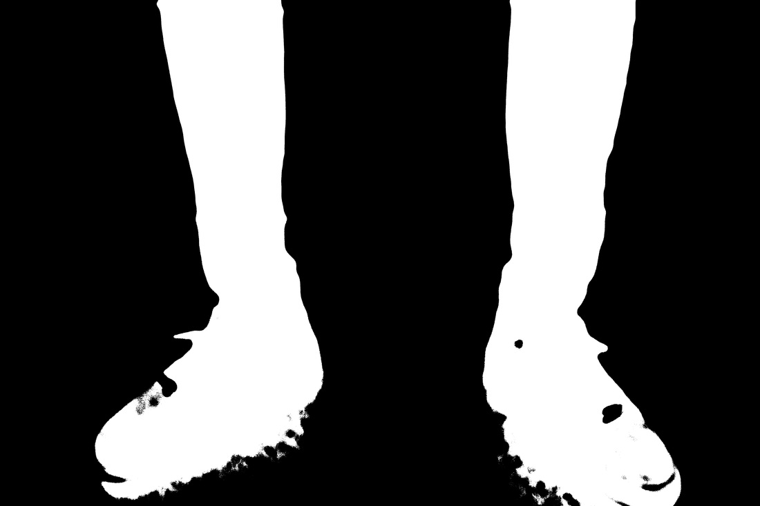
Silhouettes
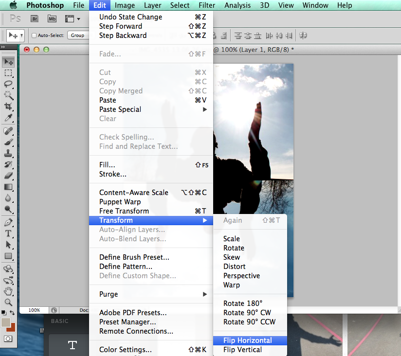
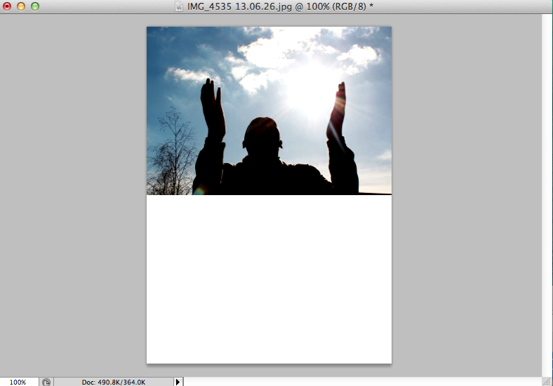
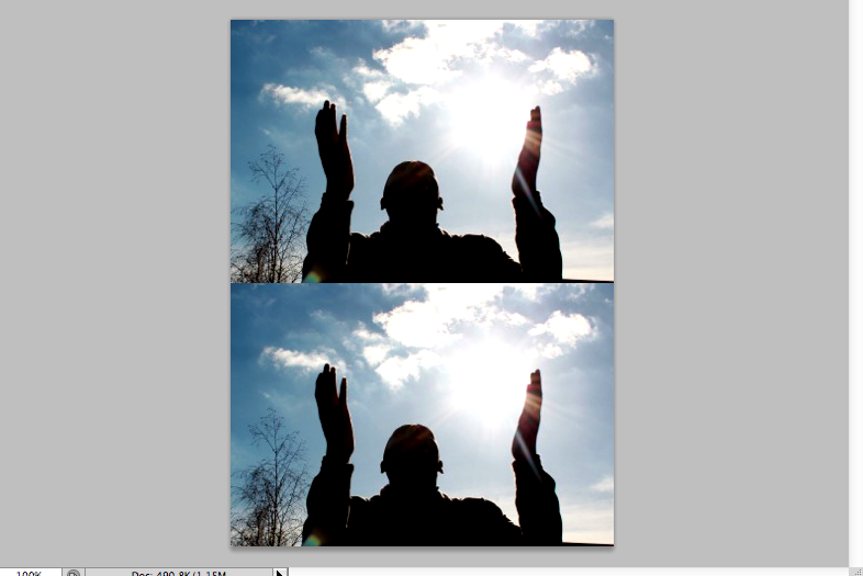
Photoshop edits
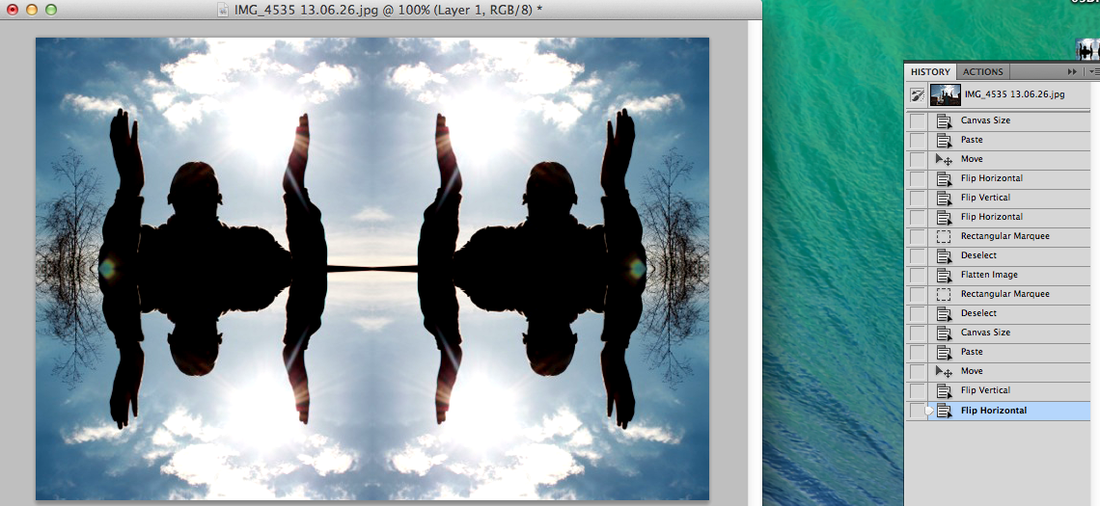
Final Images
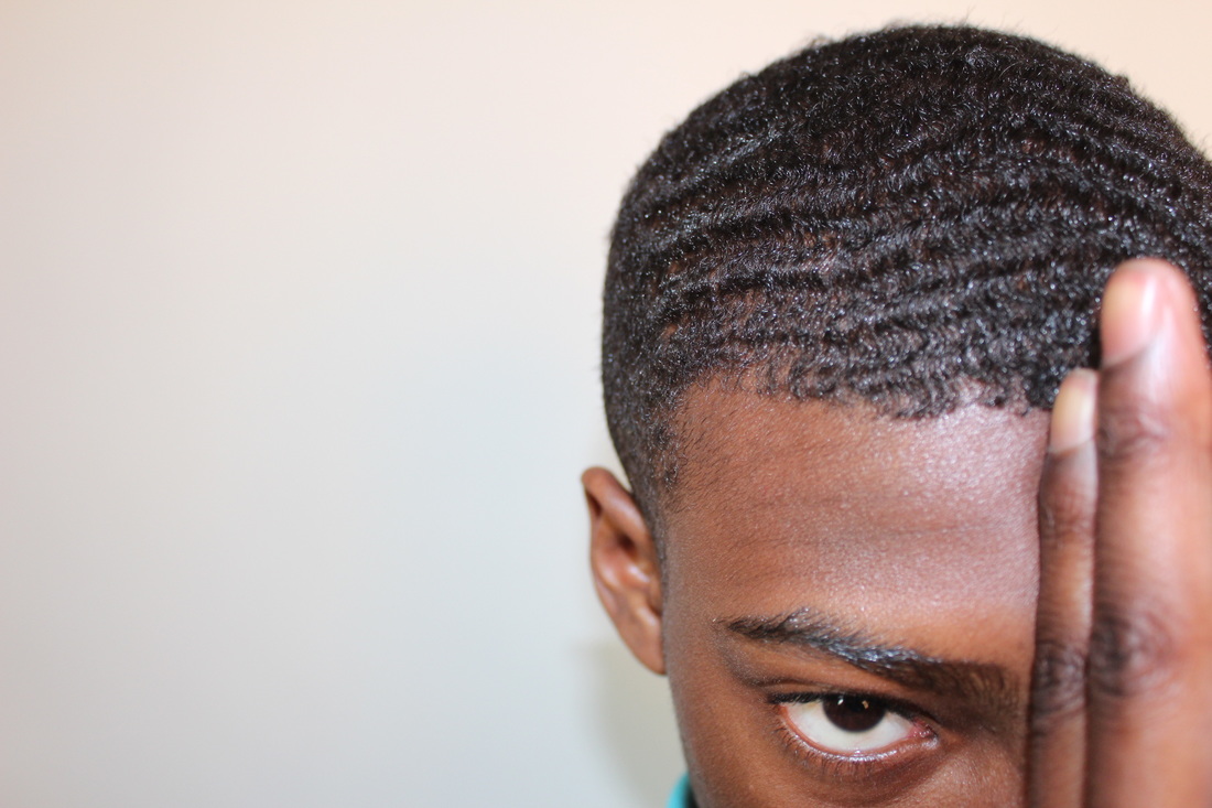
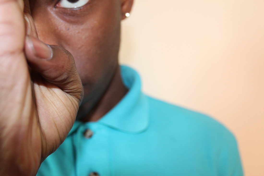
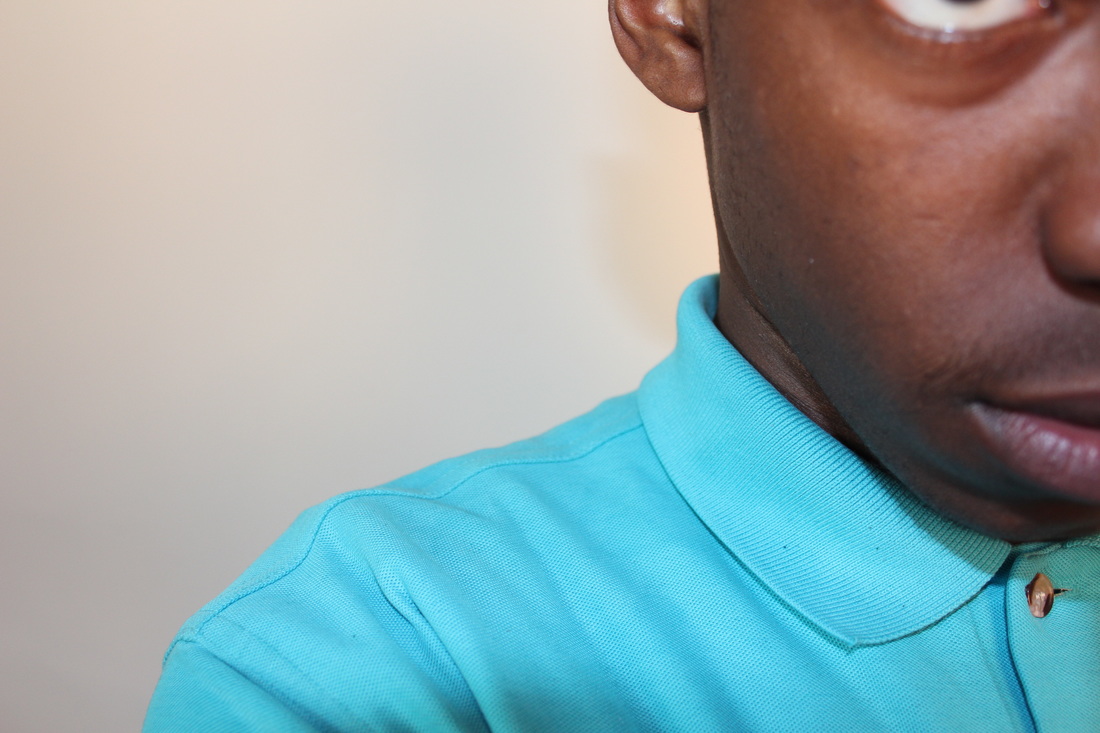

Photoshop edits


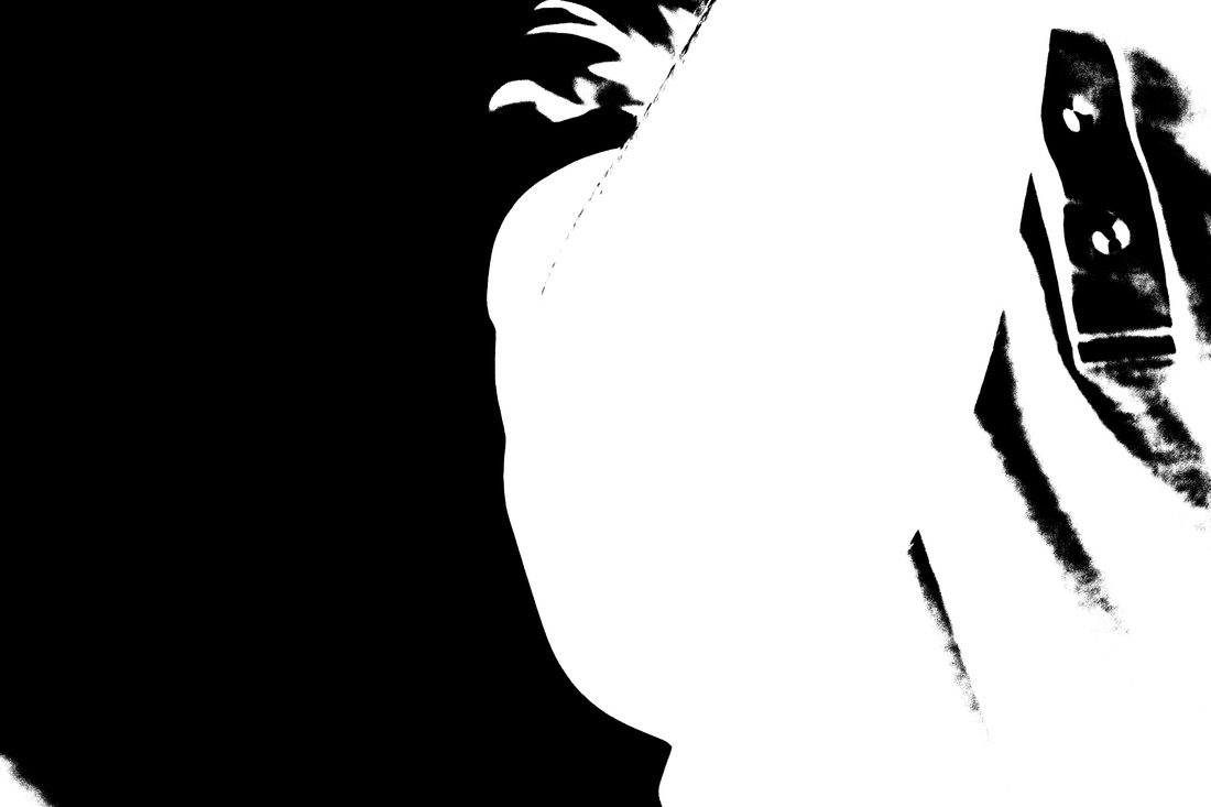
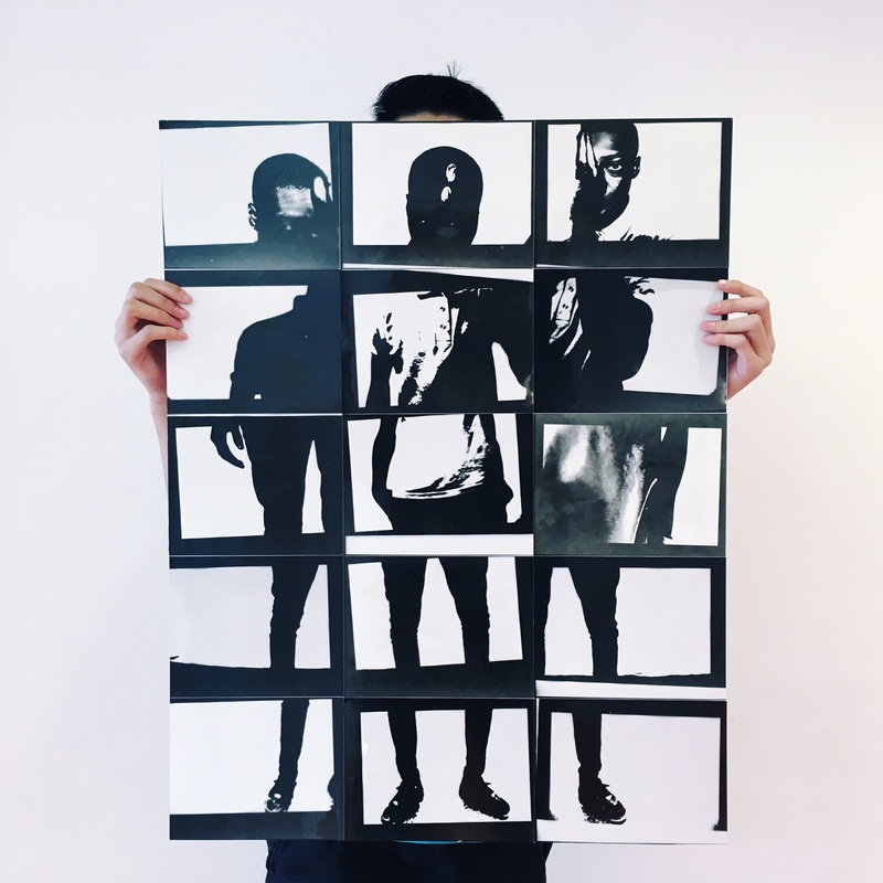
Final Image
This is the final outcome of my images, I decided to leave the black borders and not cut them off because I think it looks more unique and interesting. I have composed the images in the order of Peters body so the image looks complete. I found this image quite challenging to create because I took loads of original images of his body which made it hard to decide which images I would use.
Evaluation
I began this project by selecting one question. I chose outline because I thought that I could create a lot of interesting images from the buildings and objects around me. I started by creating a mind map of all the things I can think of related to outline. I was drawn to the idea of silhouettes and shadows because they show a clear outline in a attractive and interesting way. I then looked on the outline Pinterest board and created my own board with my favourite images, looking on Pinterest helped me with ideas that I could use for my project. I found loads of black and white silhouettes of models and portraits which displayed the theme of Outline . One image I liked in particular was the solarisation image of the hand by Man Ray. I was happy to see Man rays work because I have already researched and experimented with 'rayograms' in Unit 1, I also saw that Man Ray was a artist in the question to research. I began by researching some of Man Rays work, I added them to my website and evaluated them. After being inspired by his work, I decided to experiment with my own set of images by creating solarisation images in the dark room, I evaluated my first set of images and identified mistakes that I then improved in my next set of images.